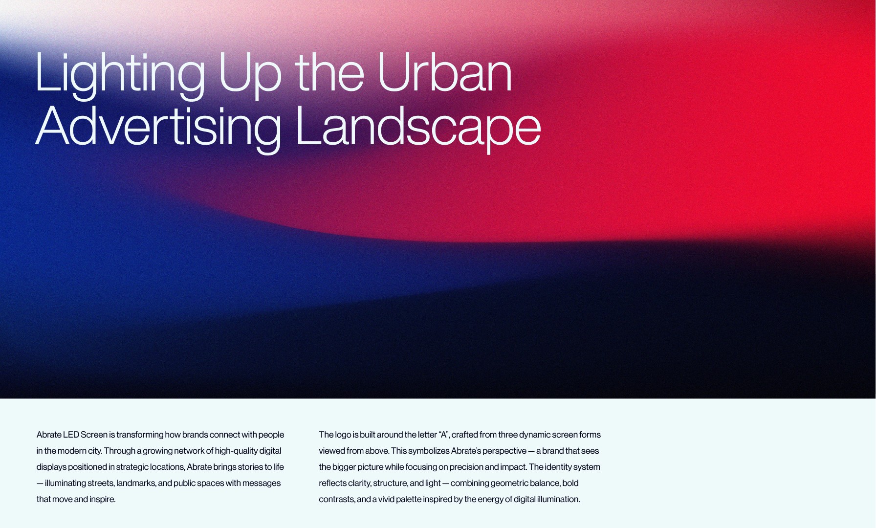
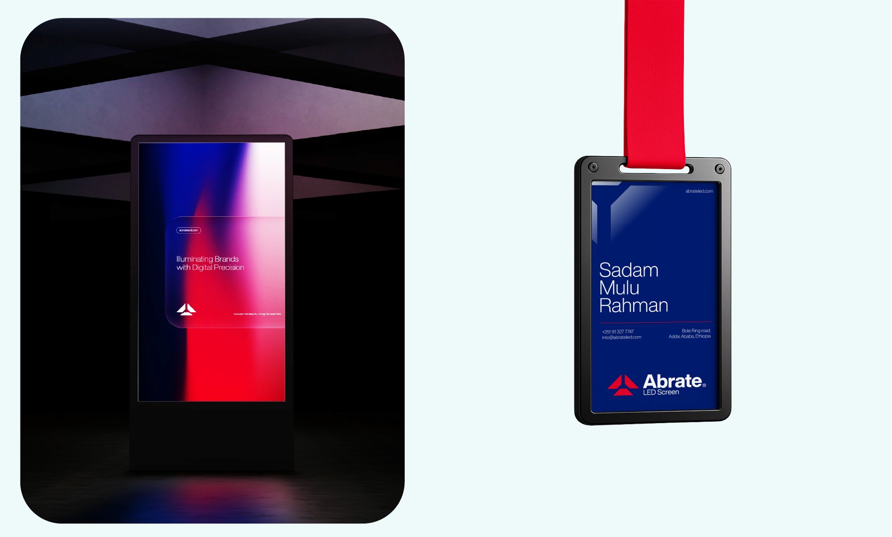
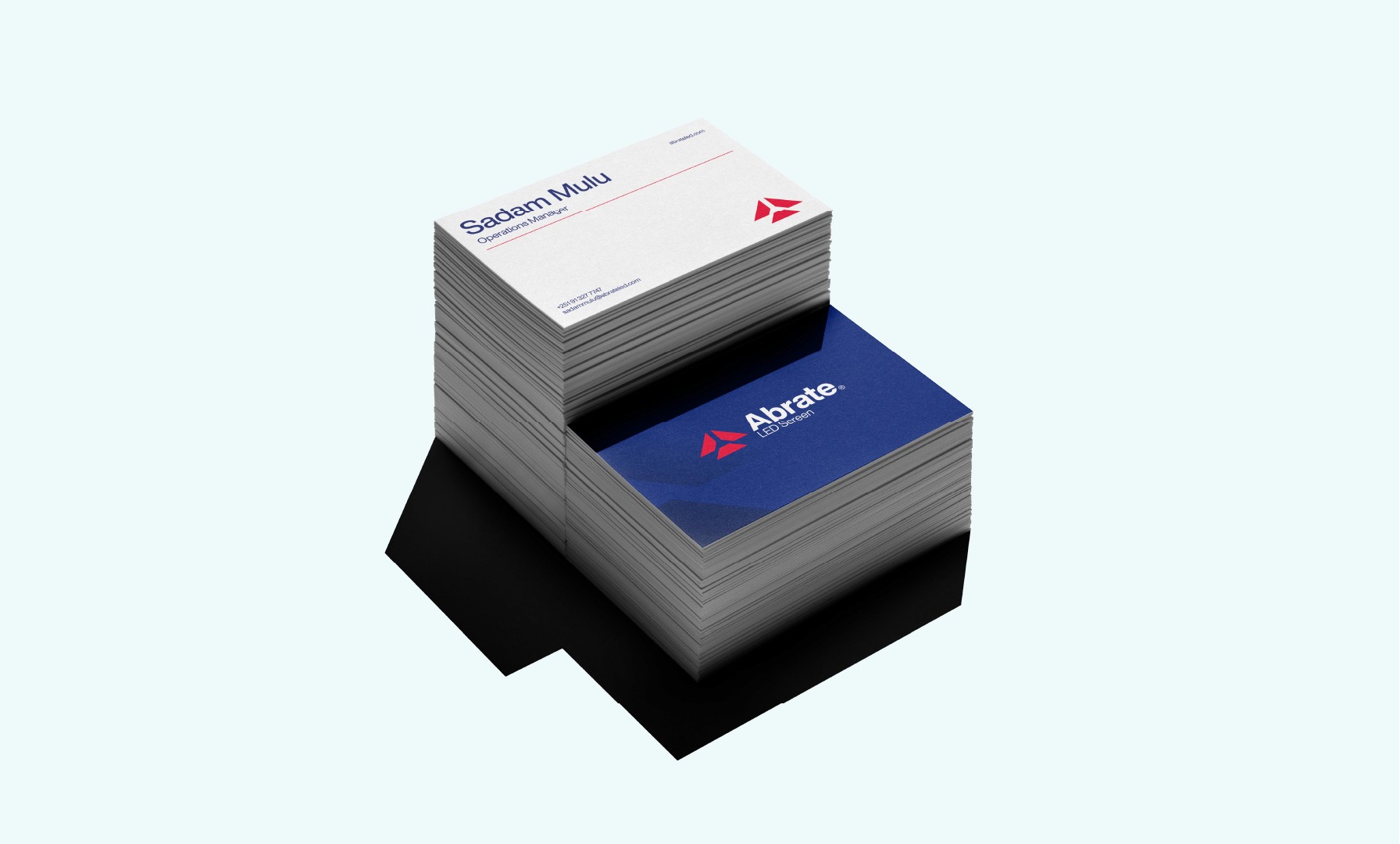
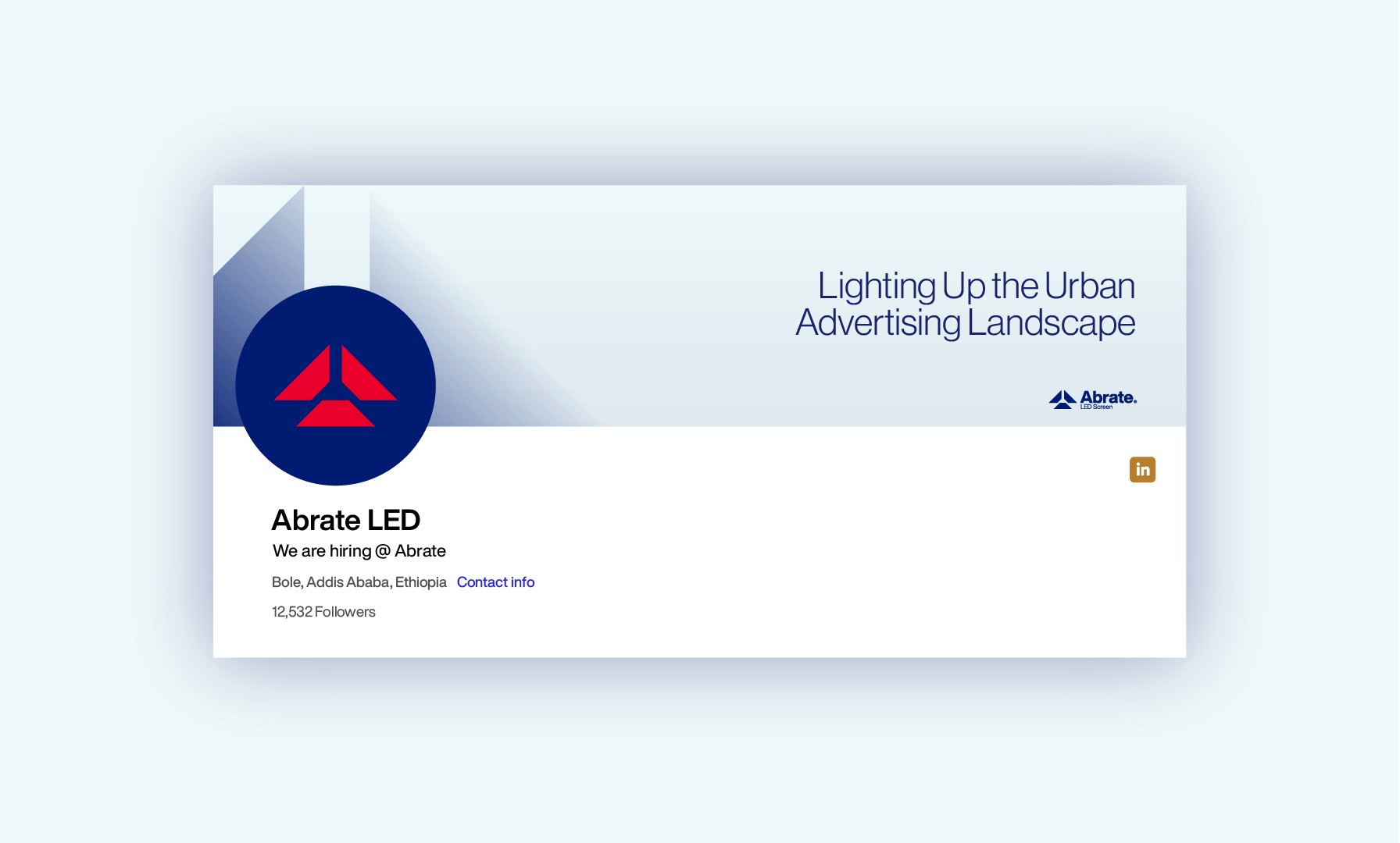
Abrate is redefining the urban advertising landscape through citywide LED networks. The goal was to build a brand identity that captures the energy of digital light and the clarity of high-visibility communication.
In the Ad-Tech space, a brand must be as bold as the content it displays. I focused on creating a system that balances technical innovation with a clean, architectural aesthetic to ensure the brand remains recognizable across massive digital displays.

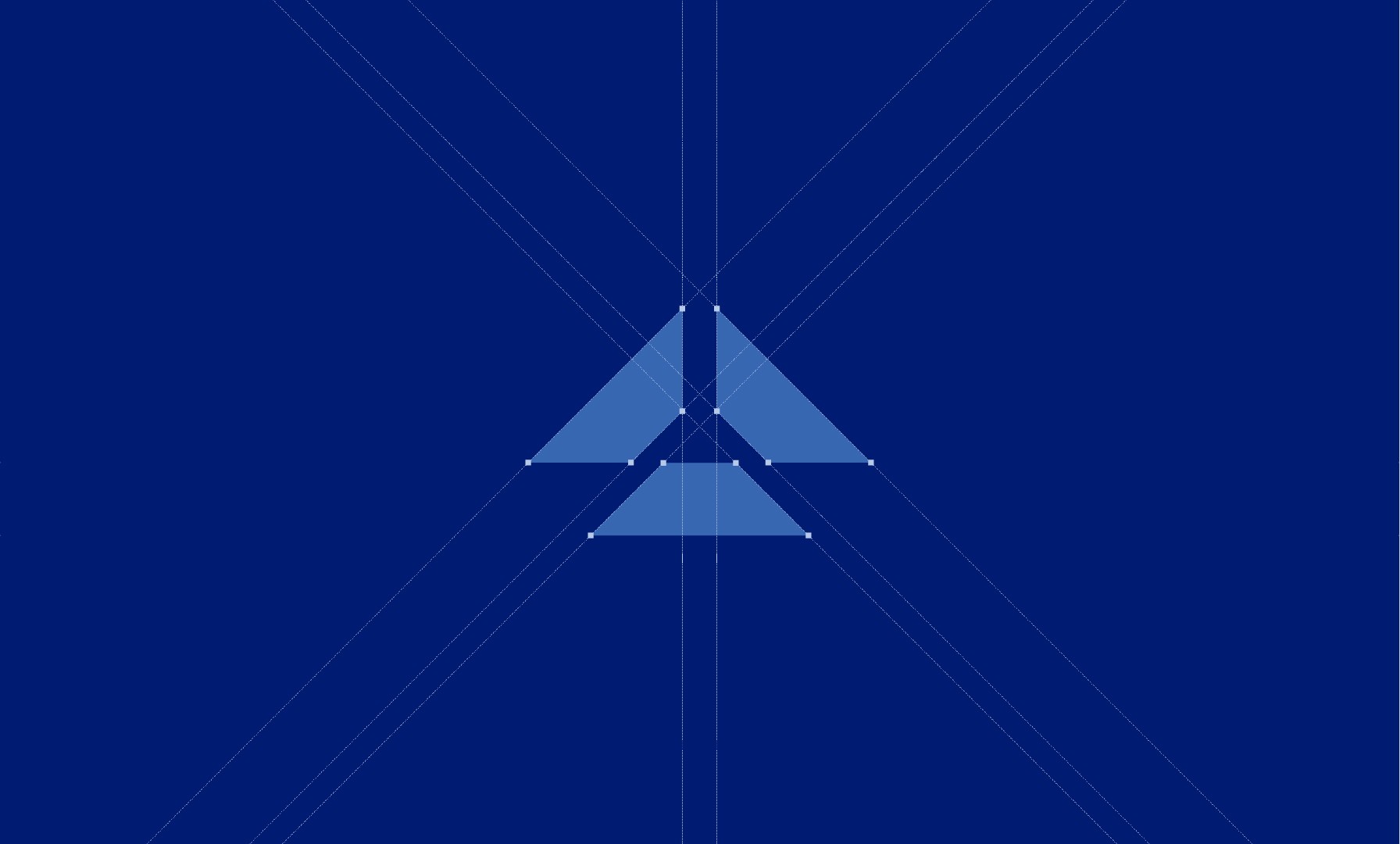
Illumination Through Perspective
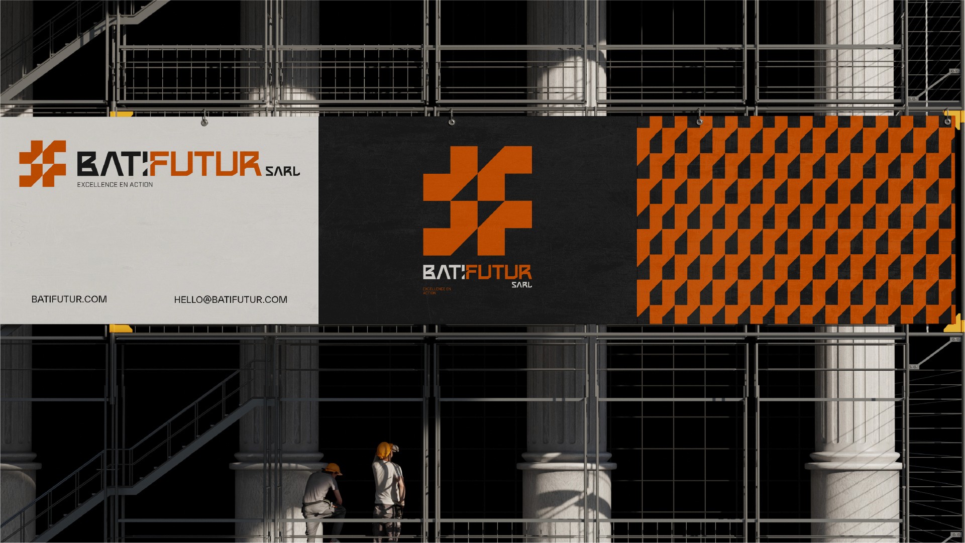
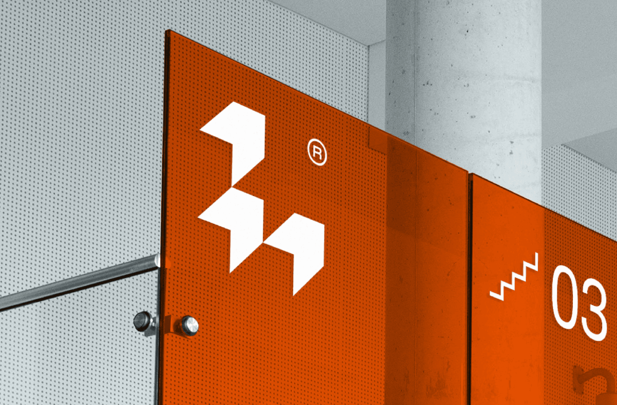
The Abrate logo is a geometric abstraction of the letter ‘A,’ constructed from three distinct panels viewed from a top-down perspective. This symbolizes the three core pillars of the business: the brand, the audience, and the display. By using a high-contrast, modern visual system, the identity reflects Abrate’s vision of lighting up the city with purposeful, dynamic advertising.