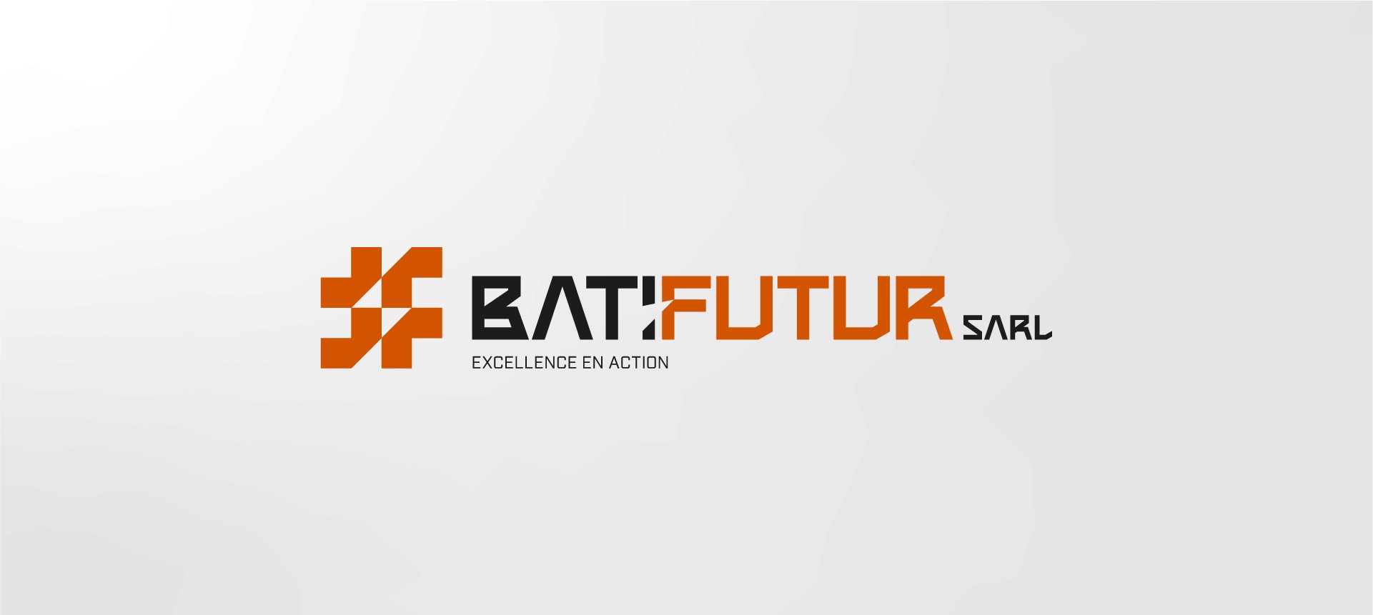
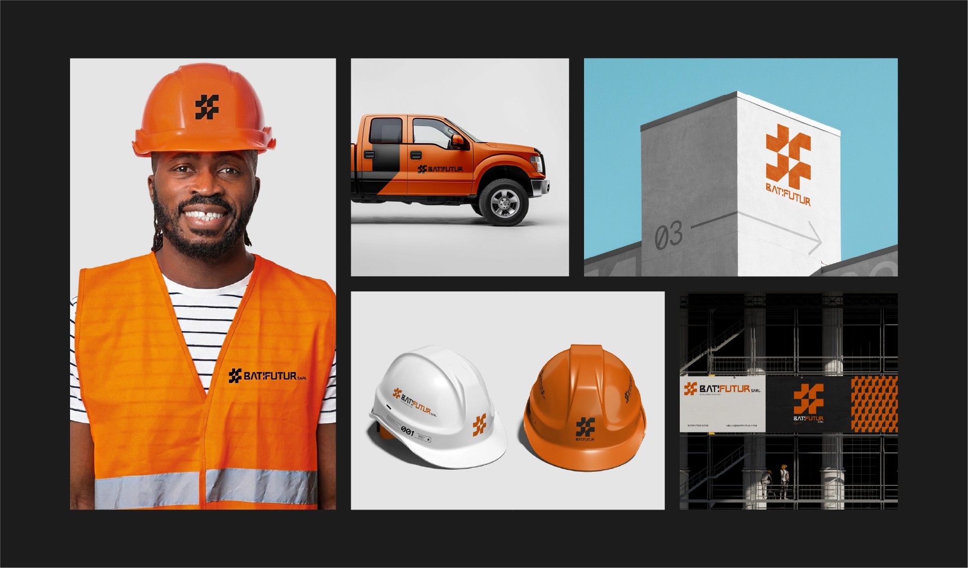
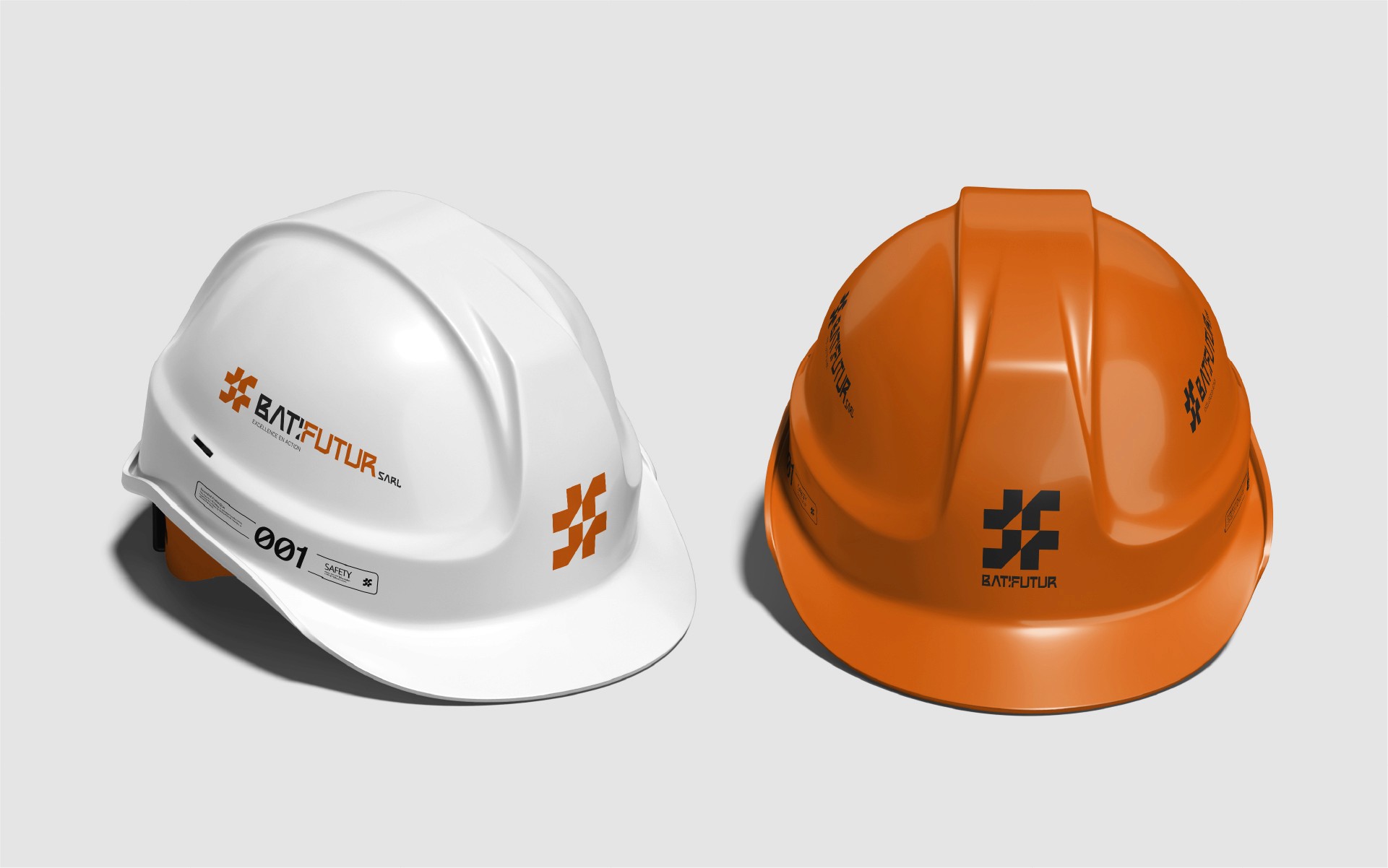
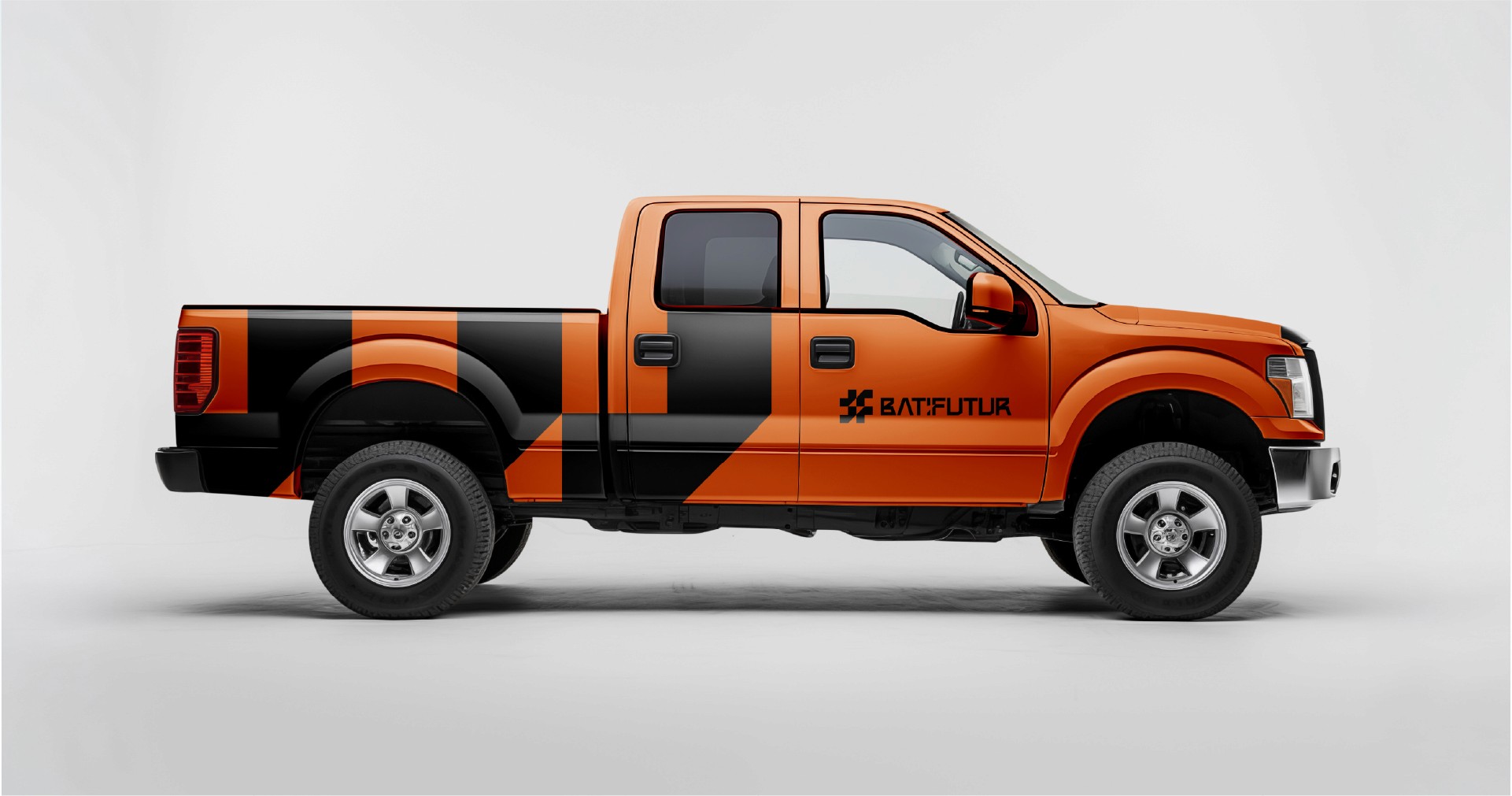
Batifutur is a modern construction and engineering partner requiring an identity as robust as the structures it builds. I developed a bold, grid-based visual system that communicates industrial strength while ensuring maximum scalability for safety gear and digital platforms.
My approach to construction branding is rooted in structural integrity. I specialize in translating complex engineering workflows into high-performance visual identities that communicate reliability and "Excellence en Action".
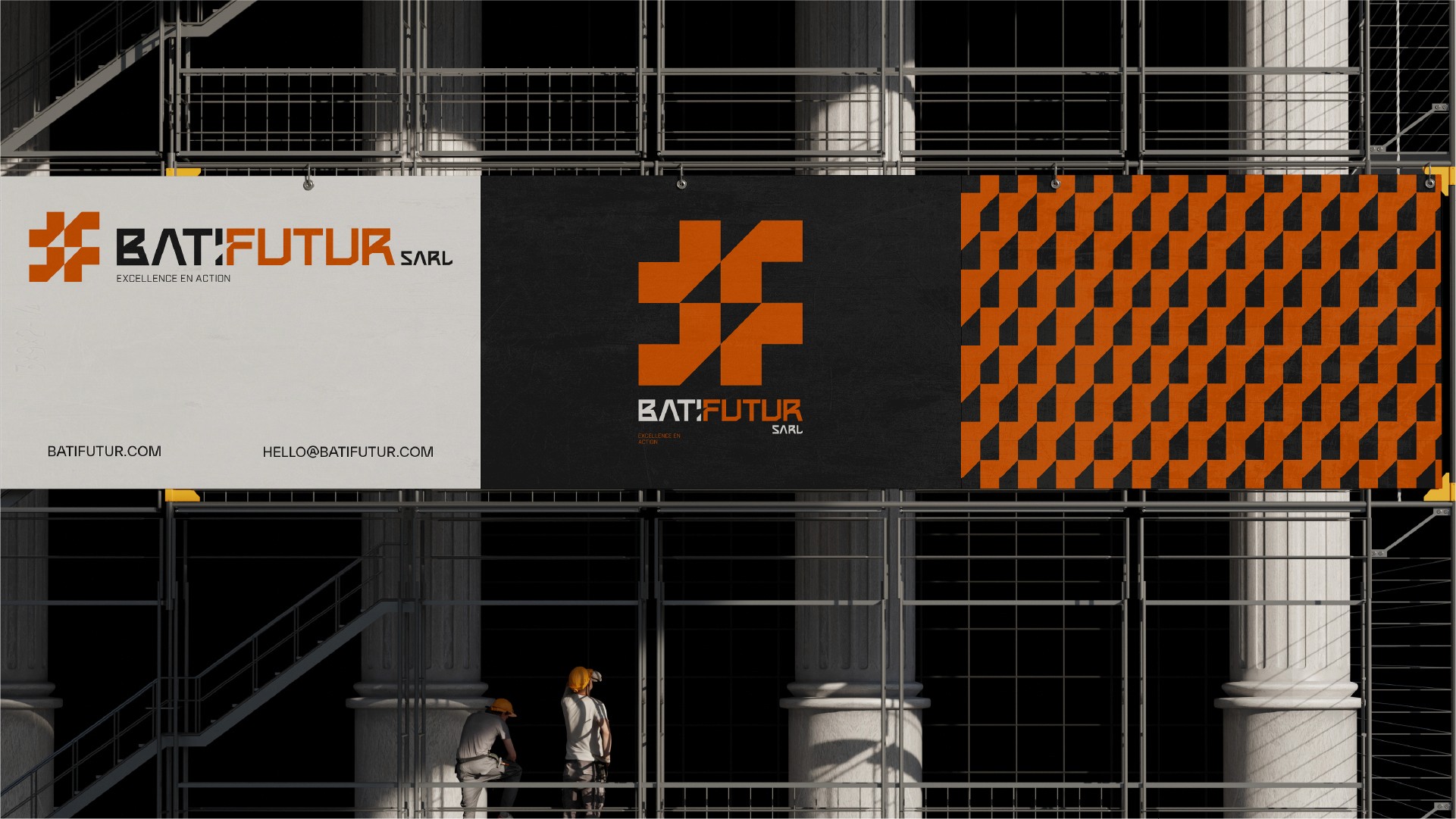
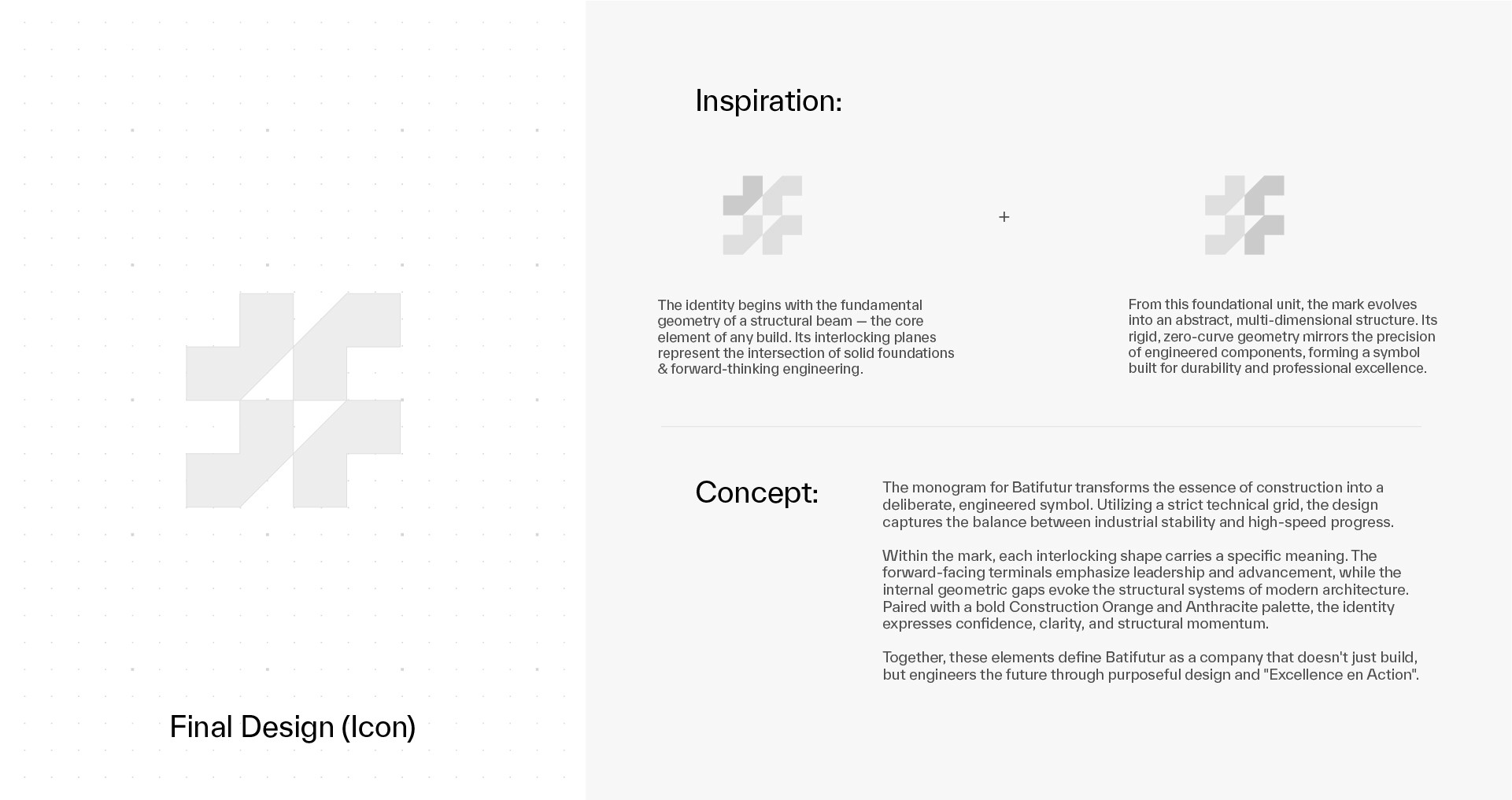
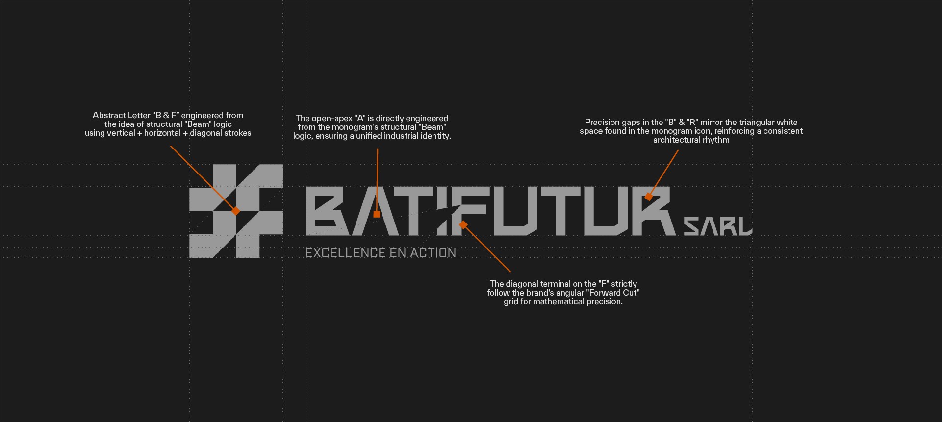
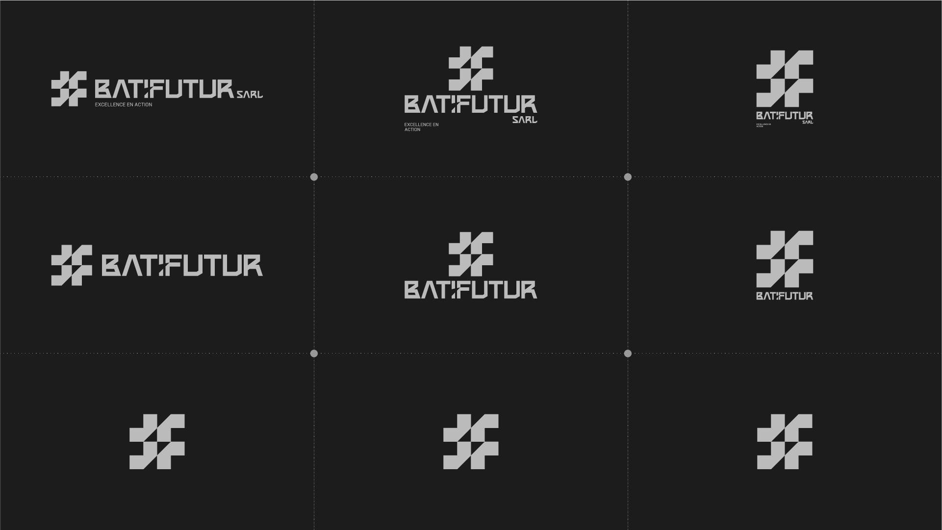
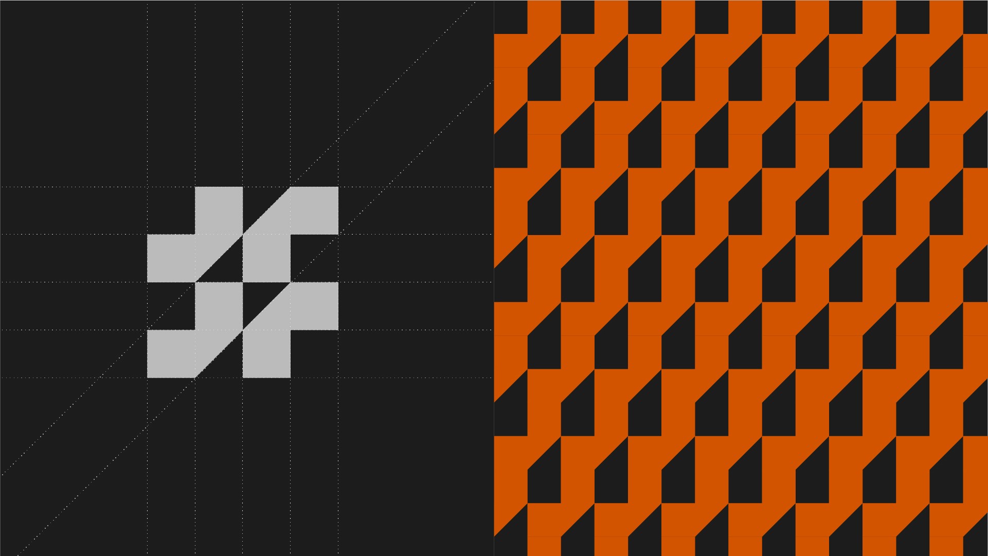
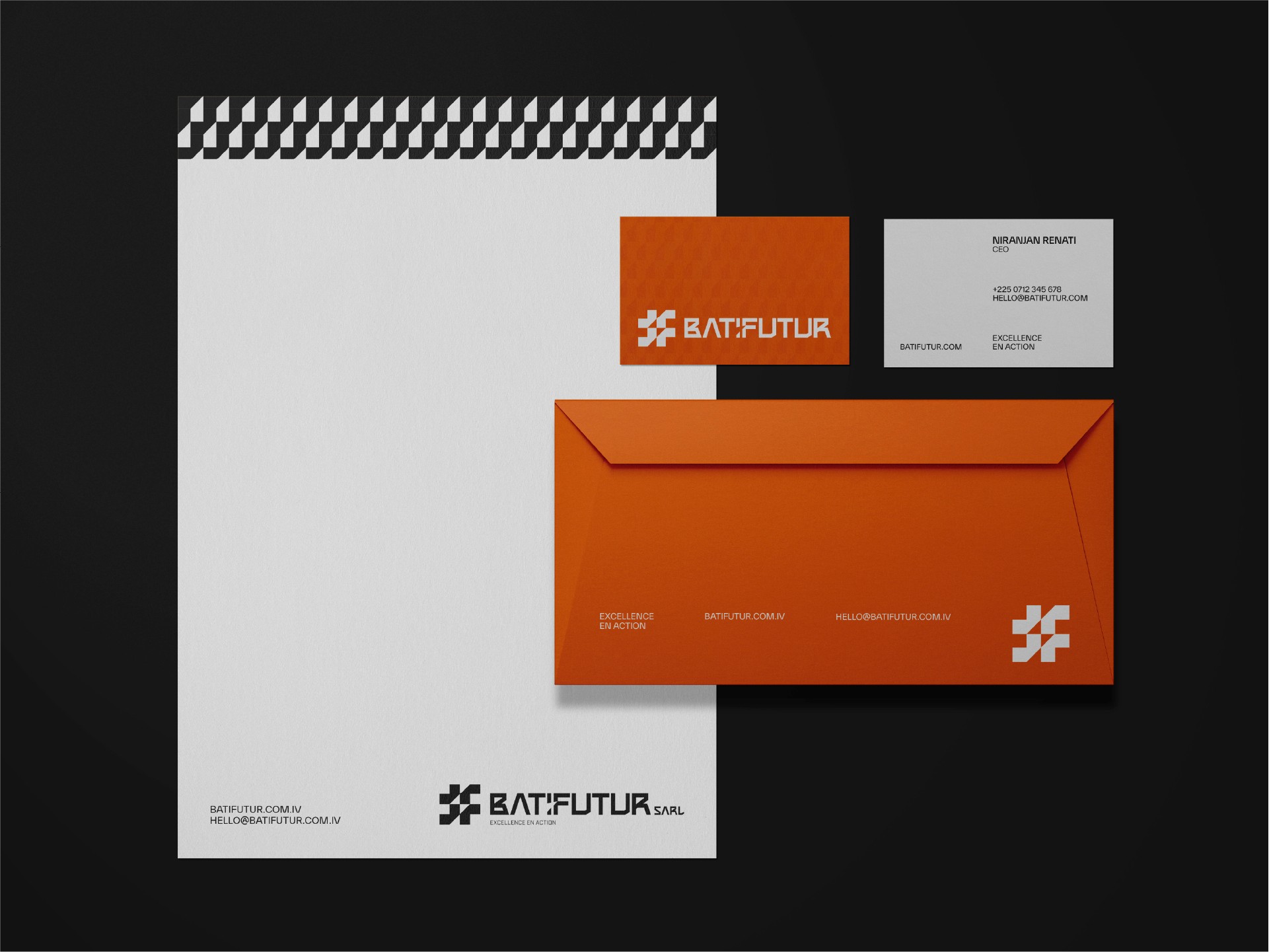
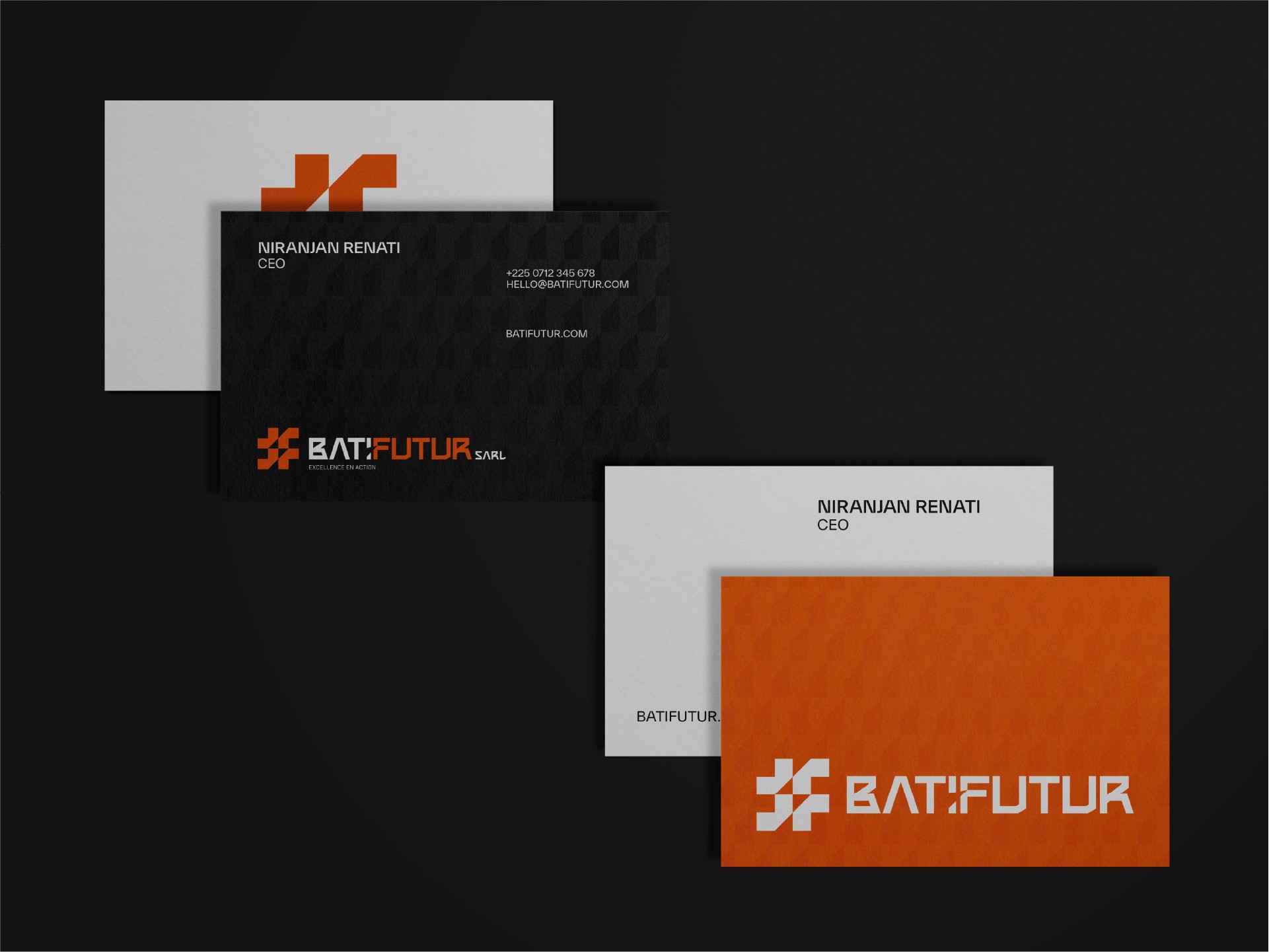
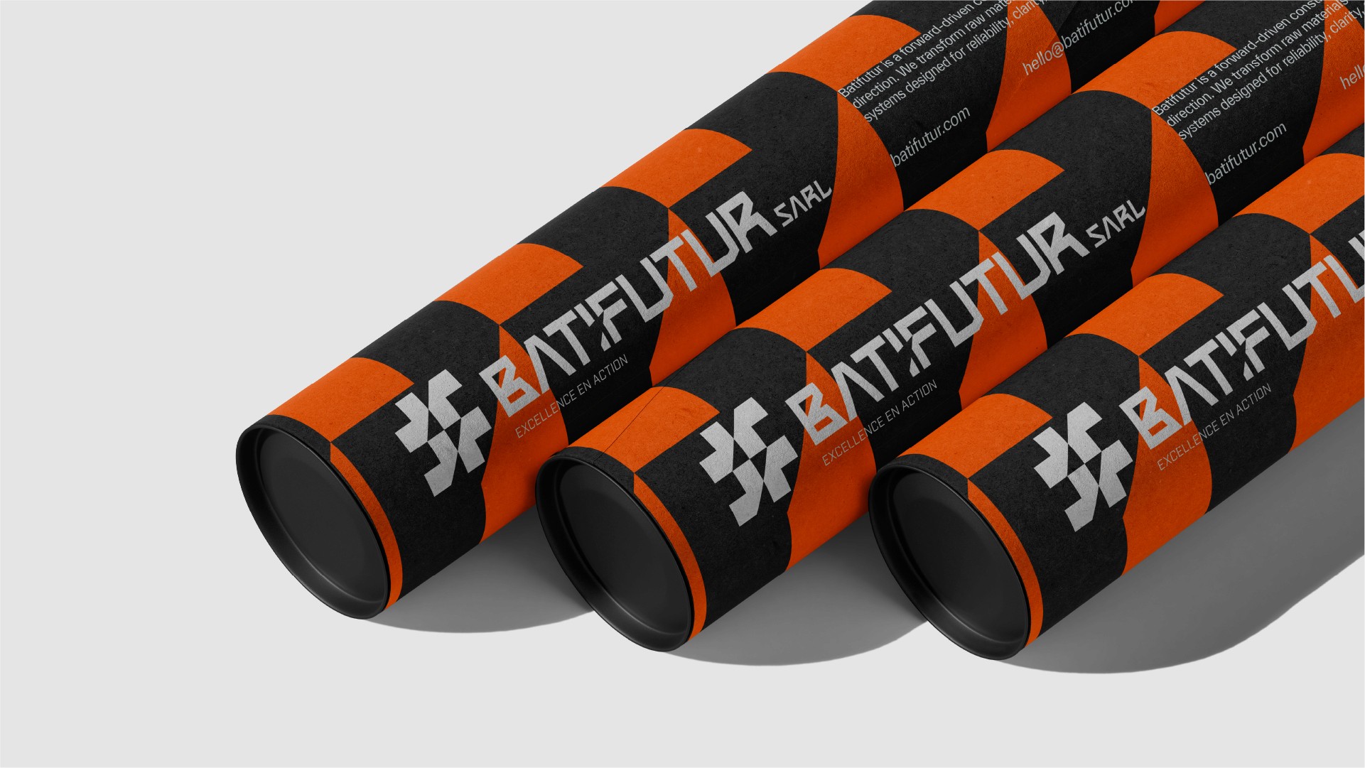
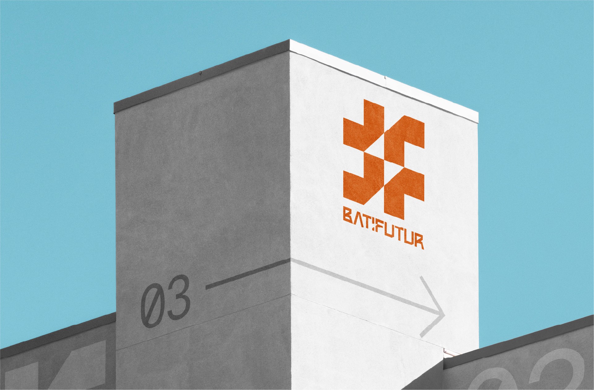
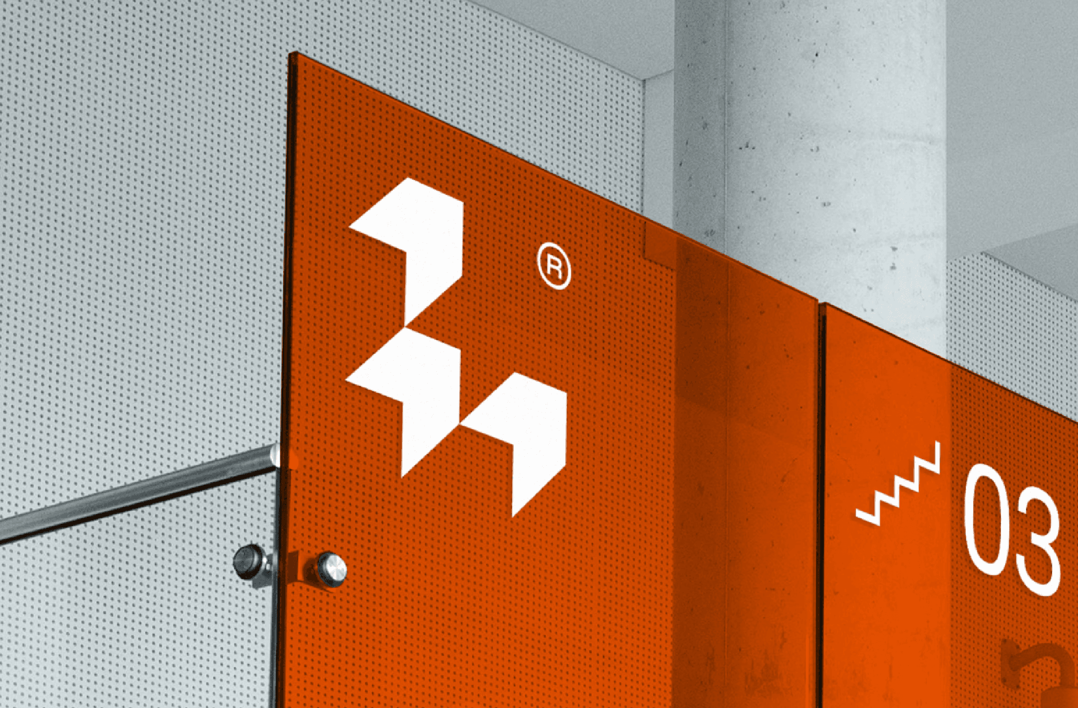
The Identity Logic
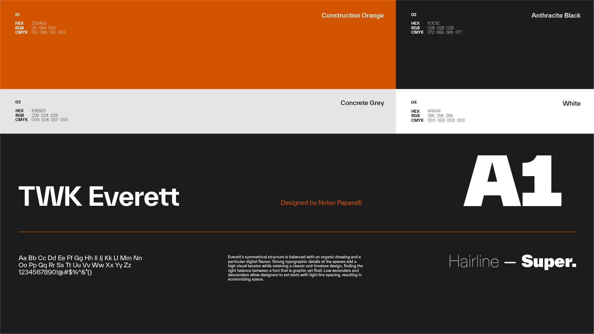
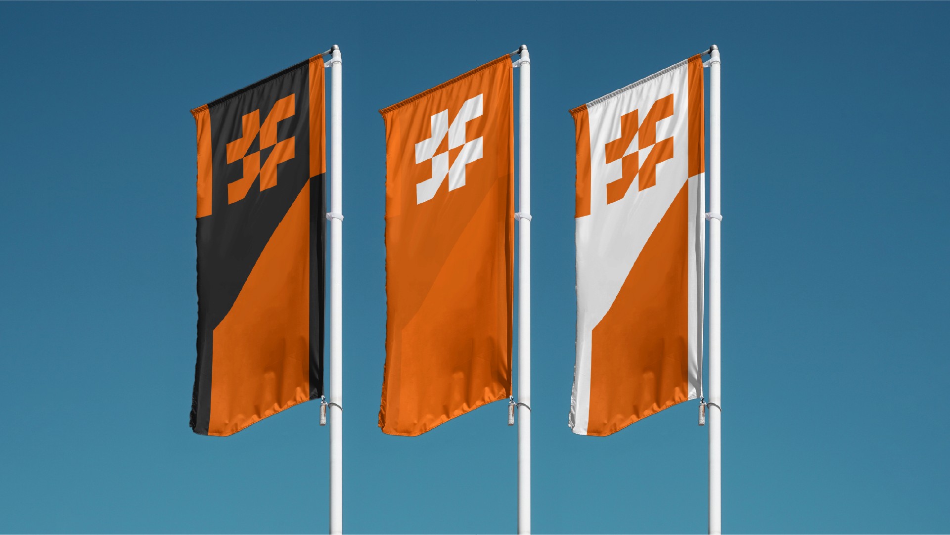
The Batifutur system is built on a technical 45-degree geometric grid. The interlocking monogram, constructed from stylized structural beams, serves as a metaphor for architectural stability and forward motion. This visual language extends into a bespoke typographic hierarchy and a high-contrast palette of Construction Orange and Anthracite, ensuring the brand maintains its "engineered" authority across every touchpoint; from high-visibility site hoardings to professional corporate documentation.