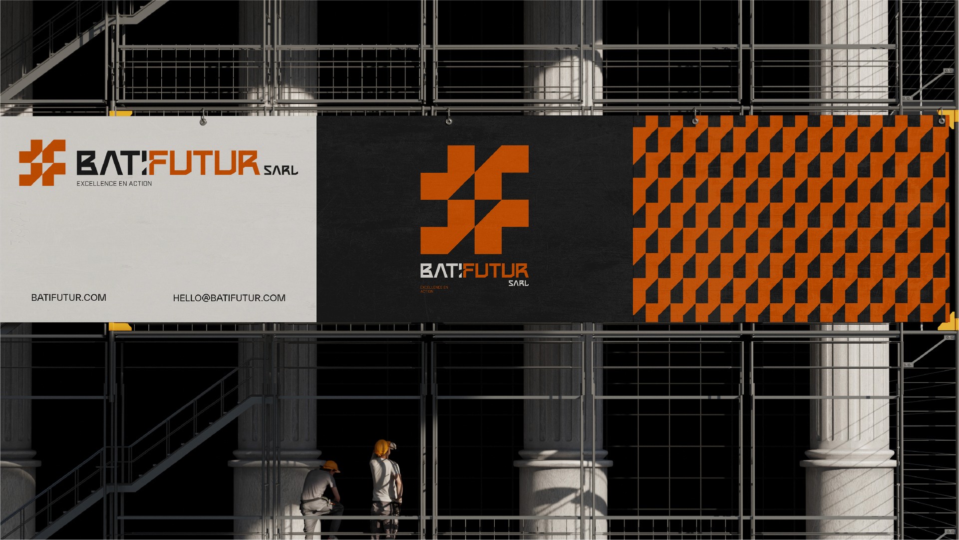
Lead is a precision engineering firm requiring an identity as rigorous as its output. I developed a bold, grid-based visual system that communicates industrial strength while ensuring digital scalability.
My approach to industrial branding is rooted in clarity. I specialize in translating technical manufacturing processes into high-performance visual identities that communicate reliability and engineering excellence.
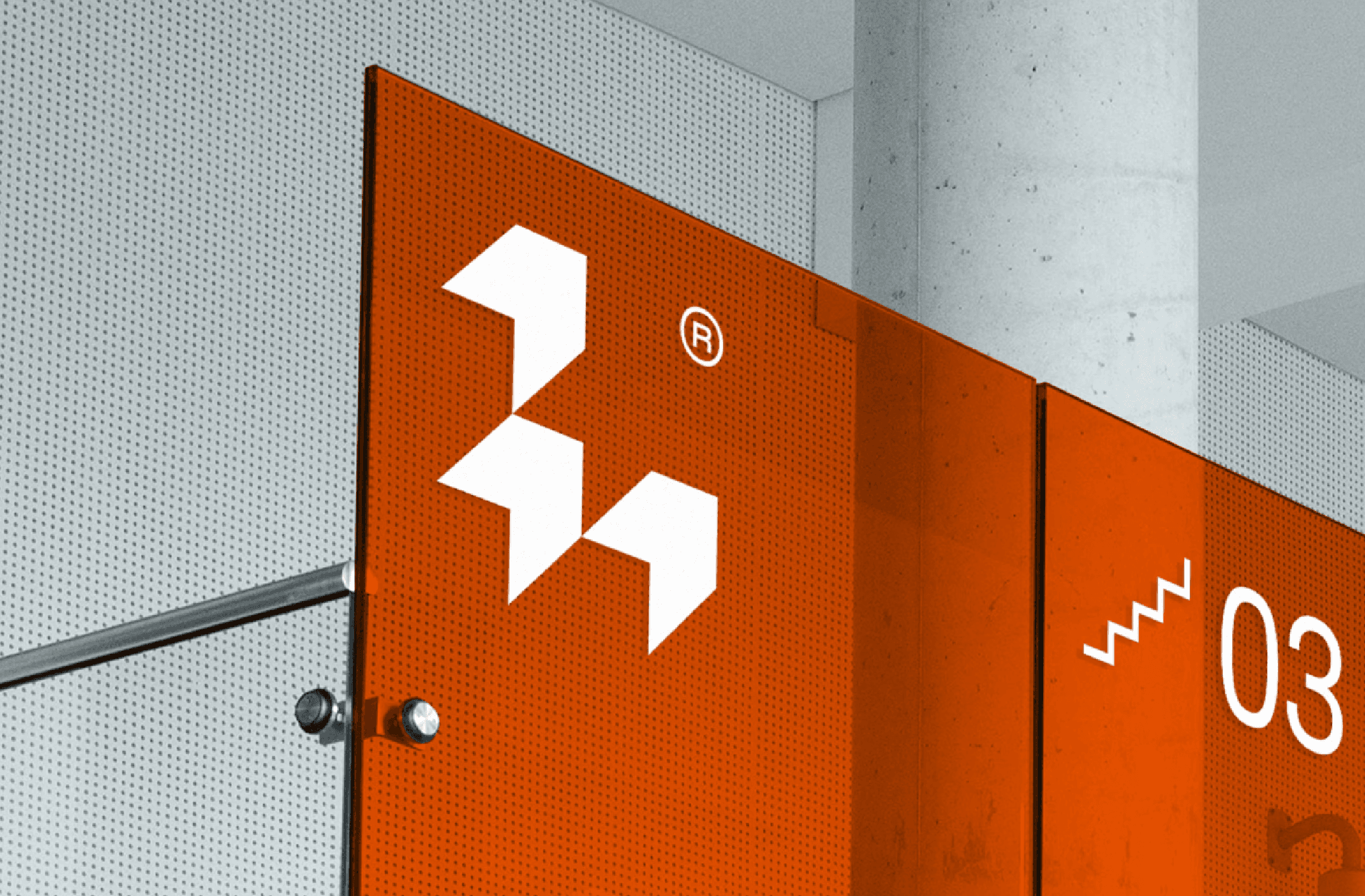
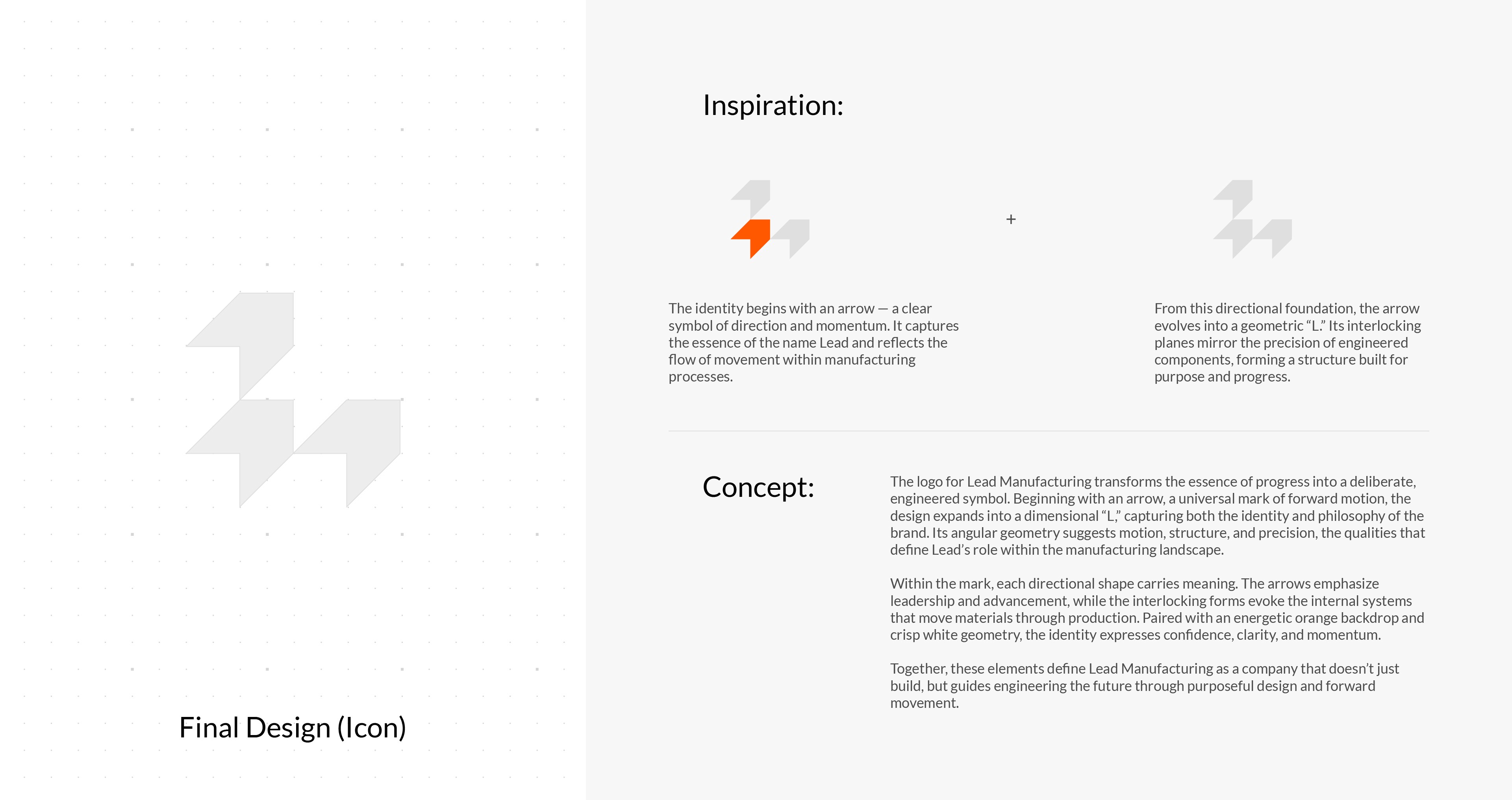
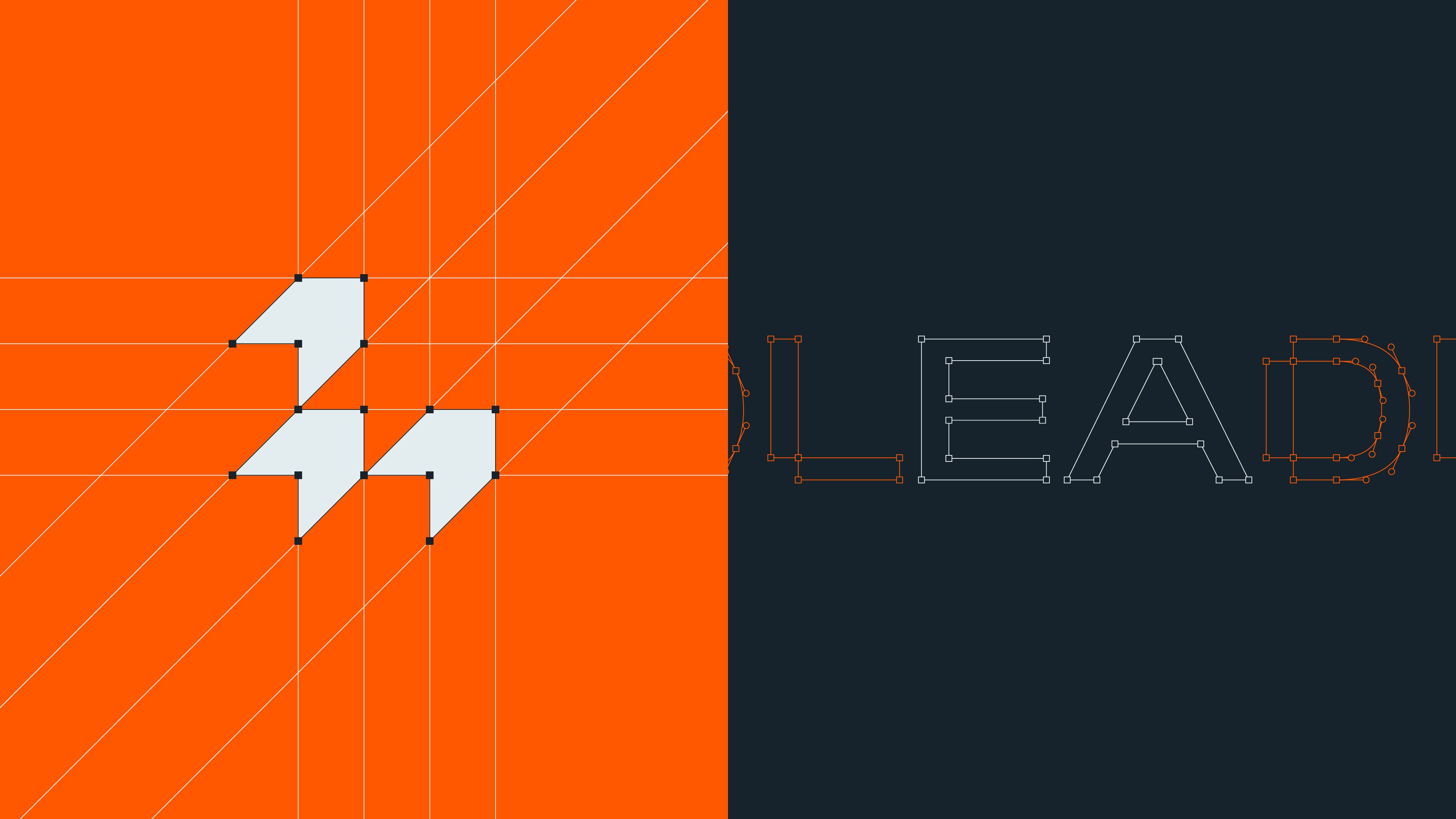
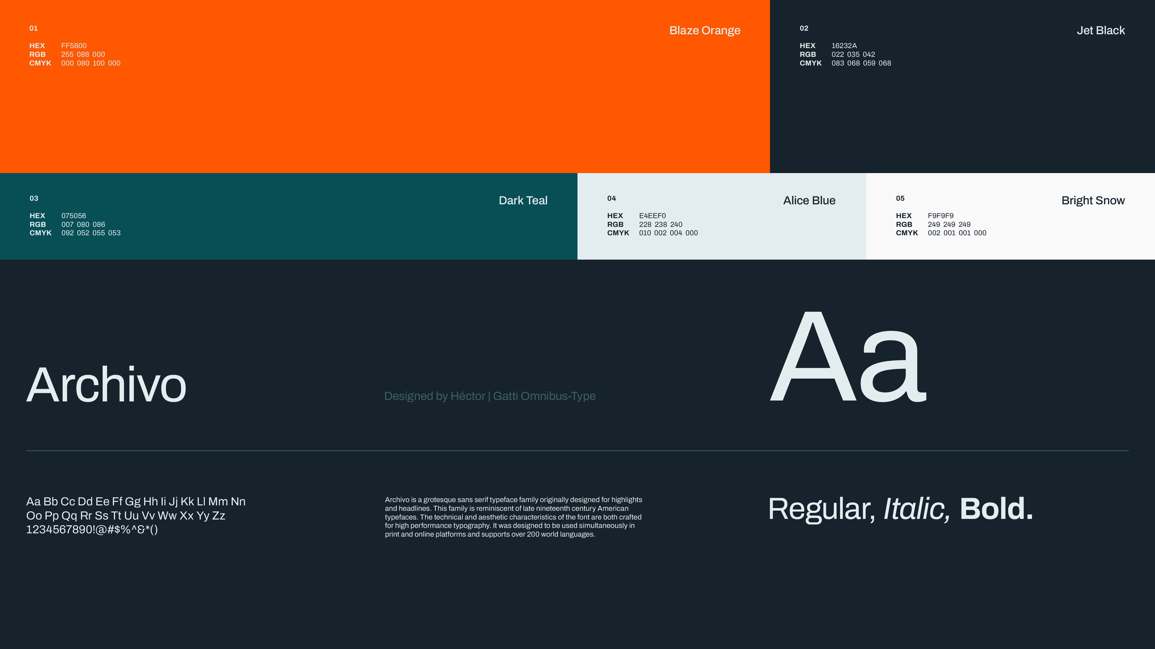
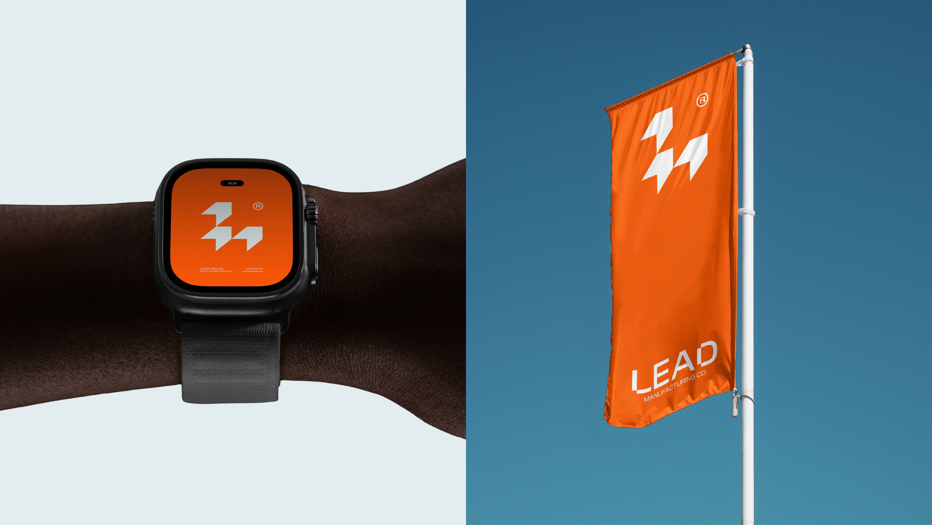
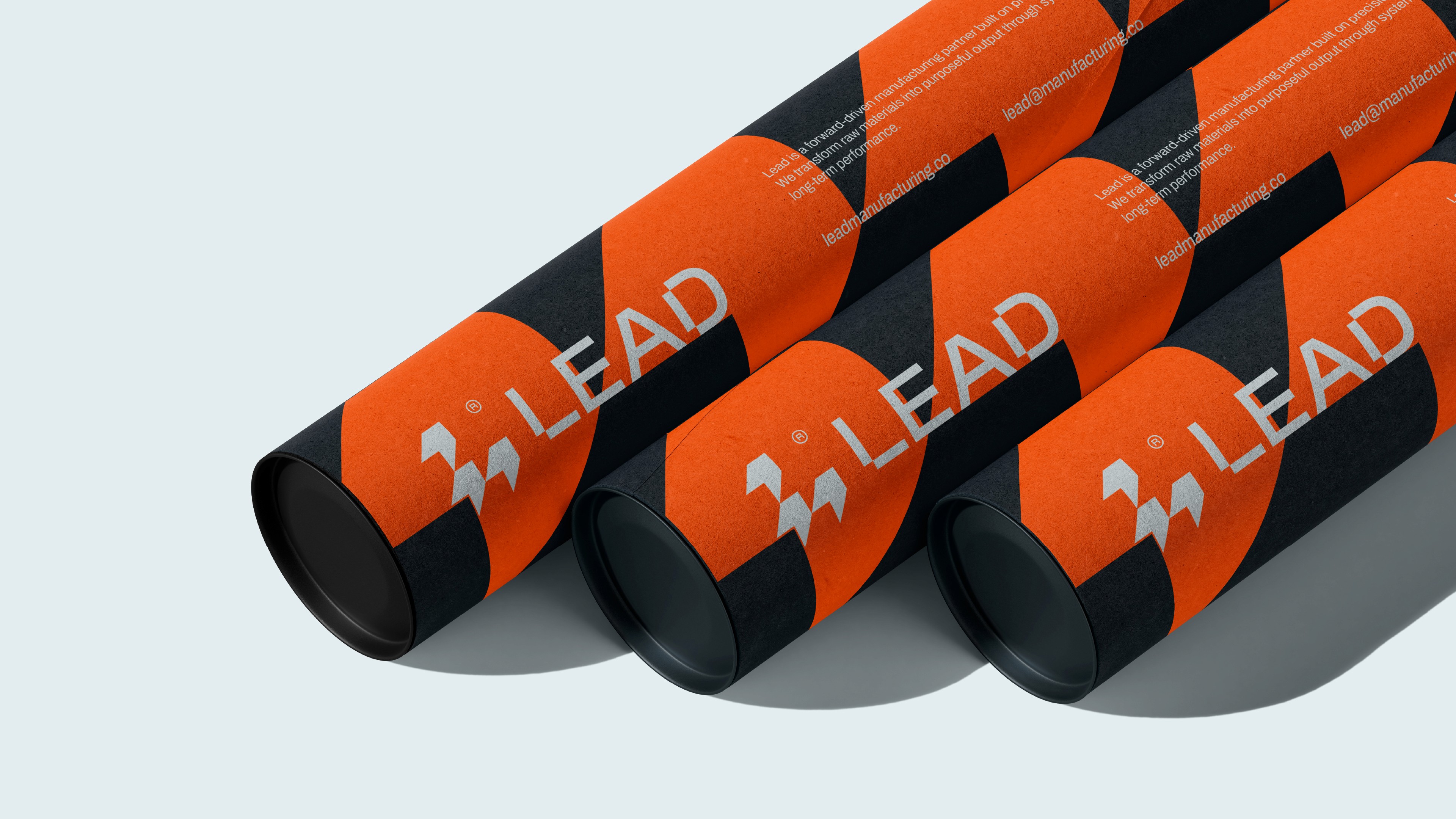
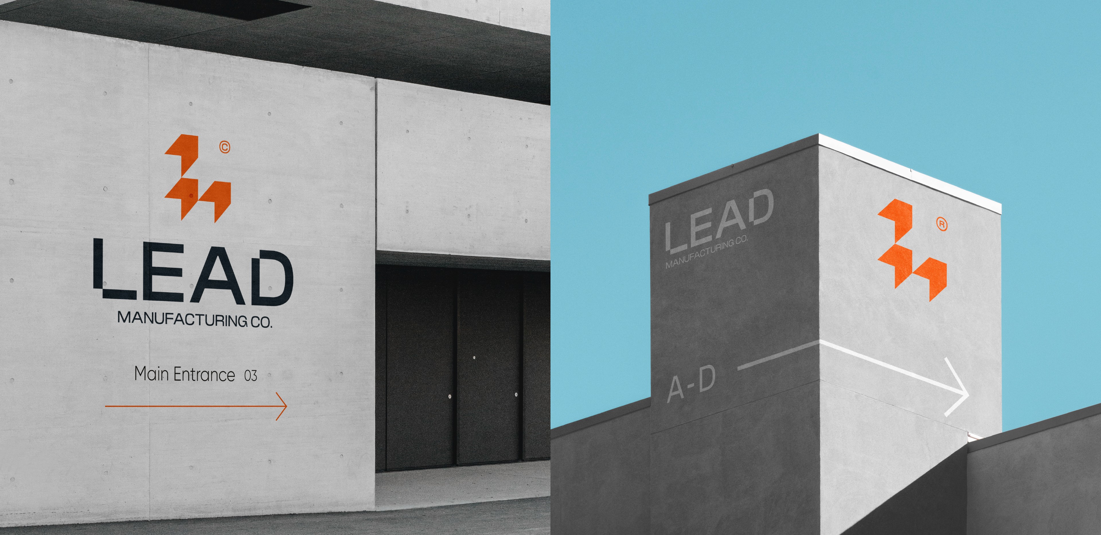
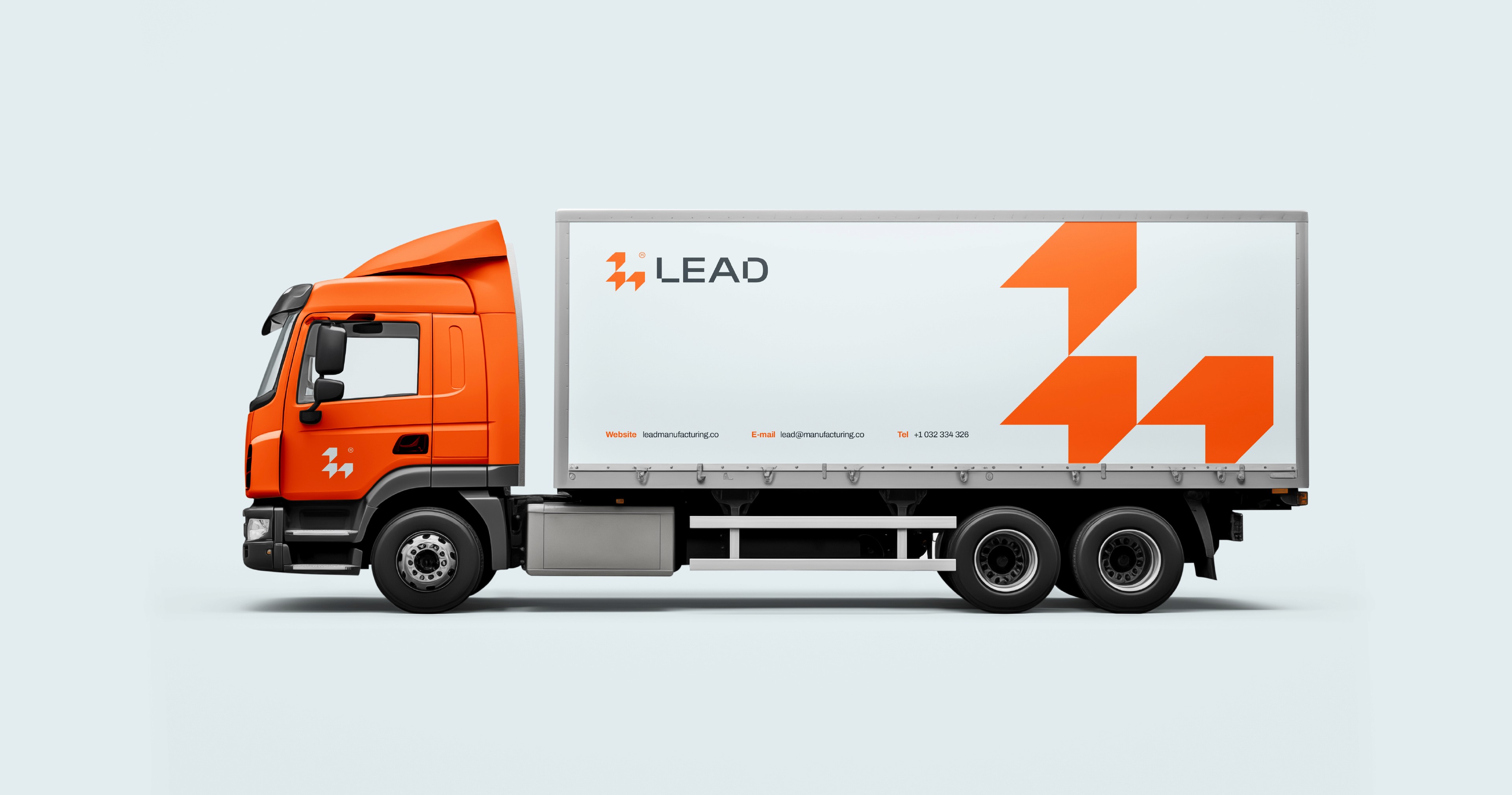
The Identity Logic
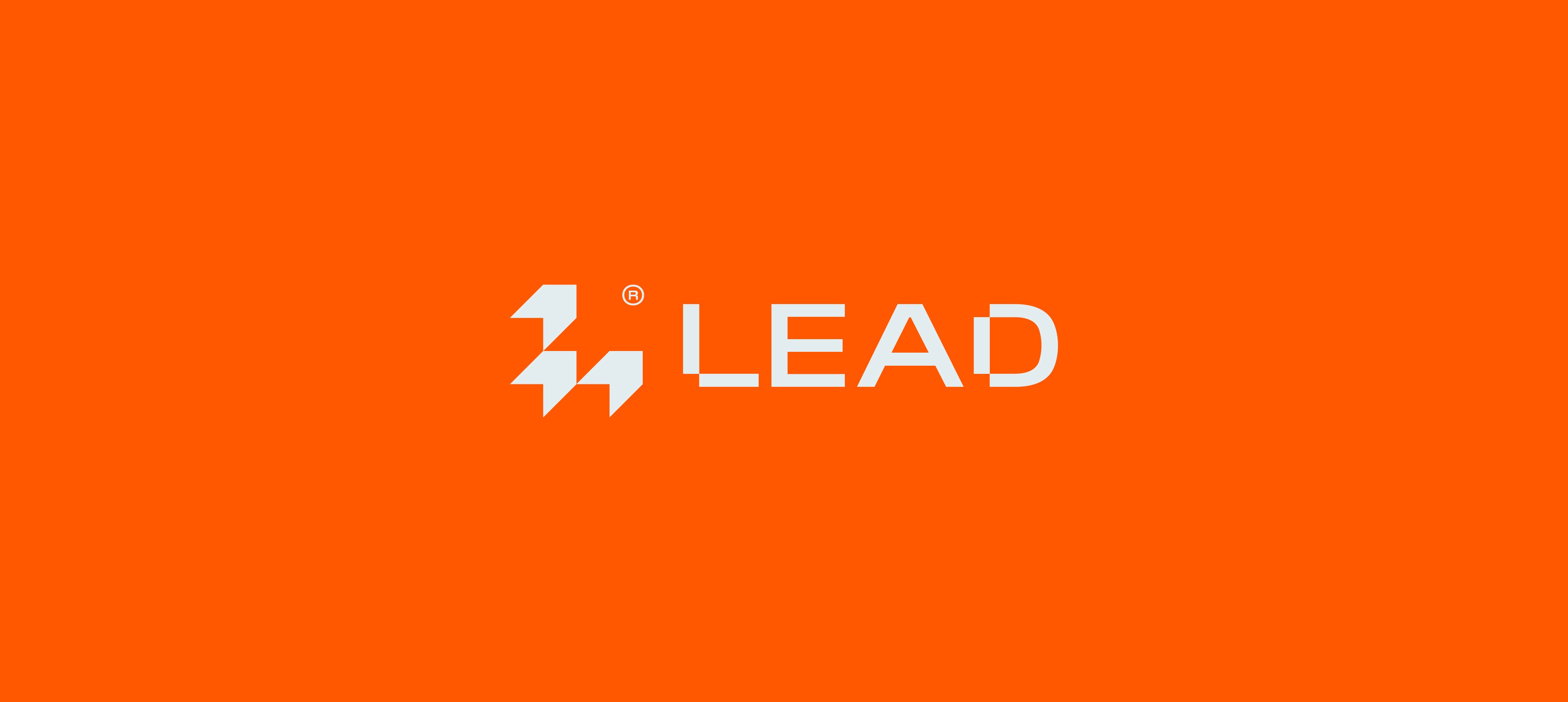
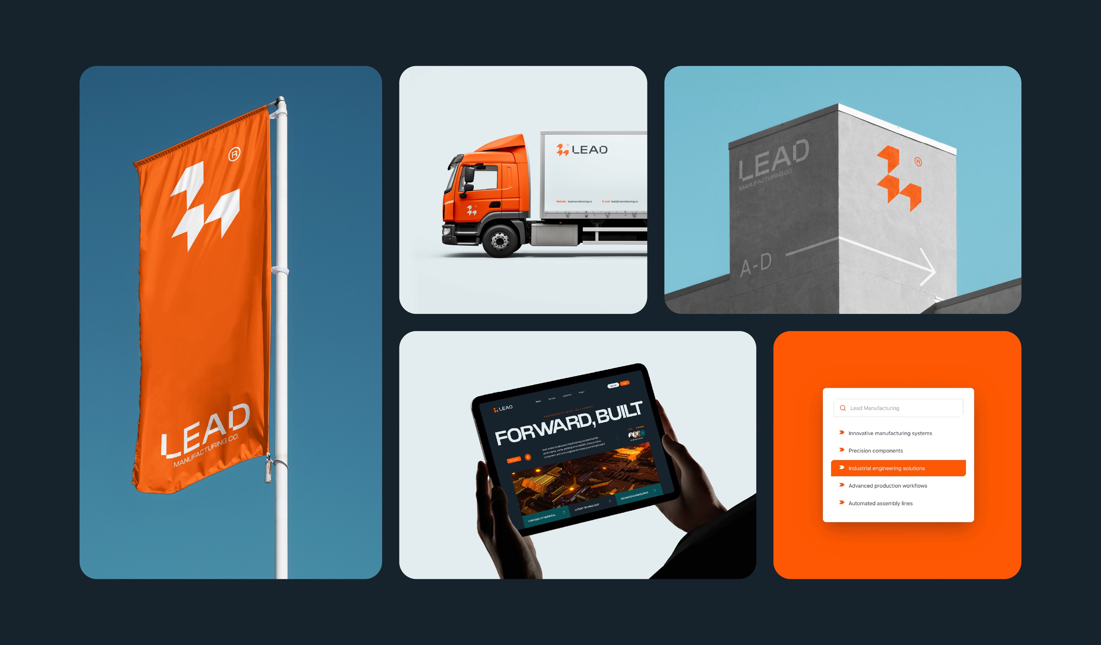
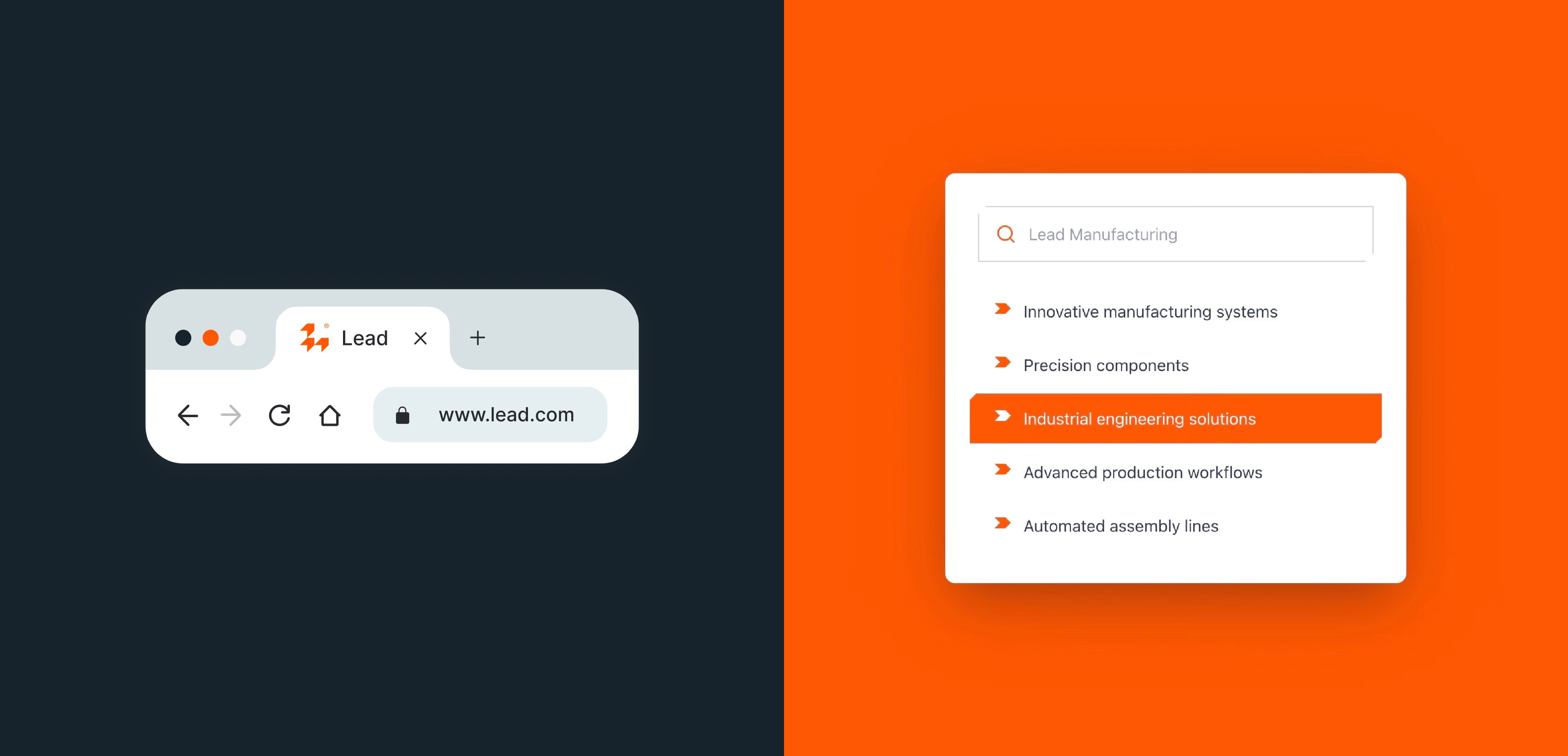
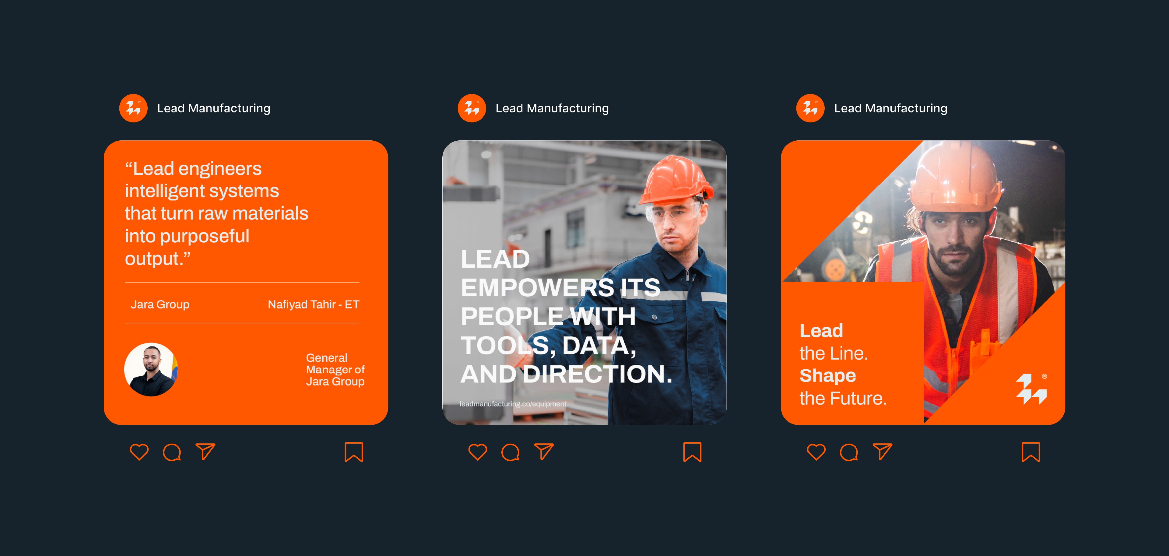
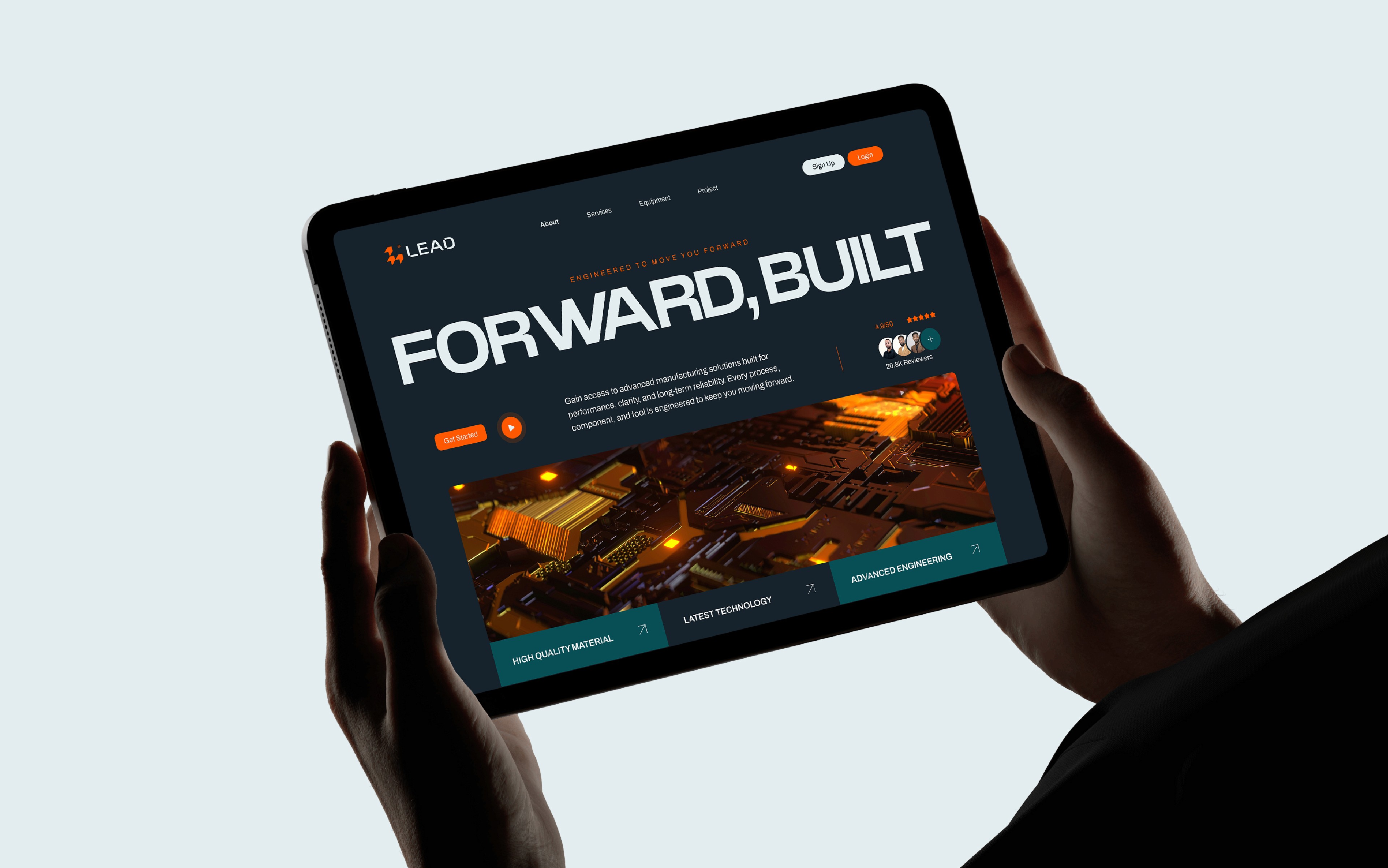
The Lead system is built on a modular geometric grid. The 'L' logomark, constructed from directional arrows, serves as a metaphor for industrial progress and leadership. This visual language extends into a rigid typographic hierarchy and a high-contrast palette, ensuring the brand maintains its 'engineered' feel across every touchpoint; from digital interfaces to physical plant signage.