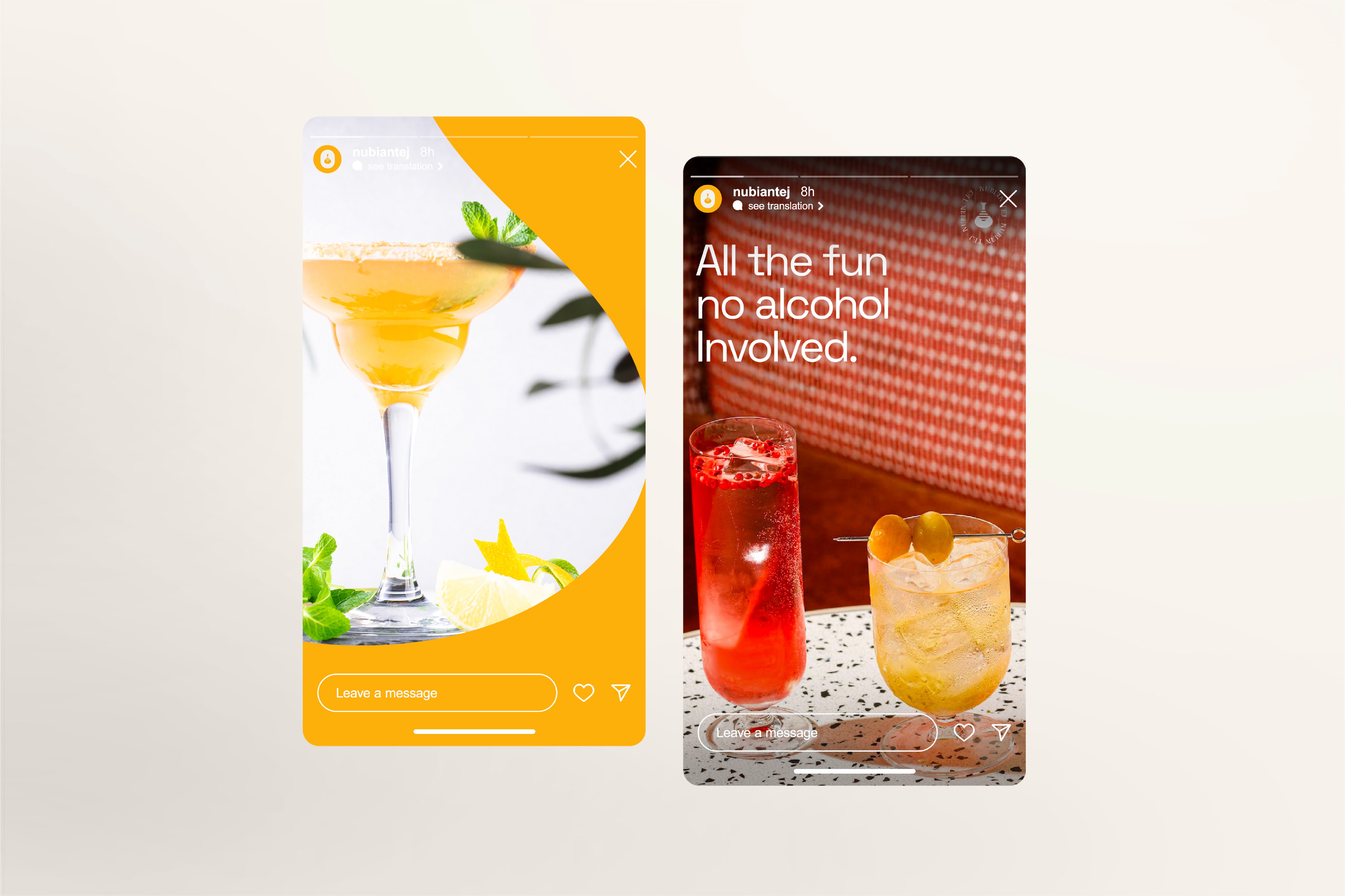
Nubian Tej is a vibrant, non-alcoholic reimagining of Ethiopia’s traditional honey wine, crafted for a style-conscious urban audience. The objective was to build a brand that balances deep cultural pride with a fresh, social attitude, positioning a heritage drink as a premium lifestyle choice for the modern adult.
In the consumer lifestyle space, the challenge is to move a product from "traditional" to "aspirational" without losing its soul. My approach focused on building a scalable visual system that utilizes heritage-inspired motifs—like the berele flask—reimagining them through a minimalist, geometric lens to ensure the brand feels as at home in a high-end lounge as it does in a cultural celebration.
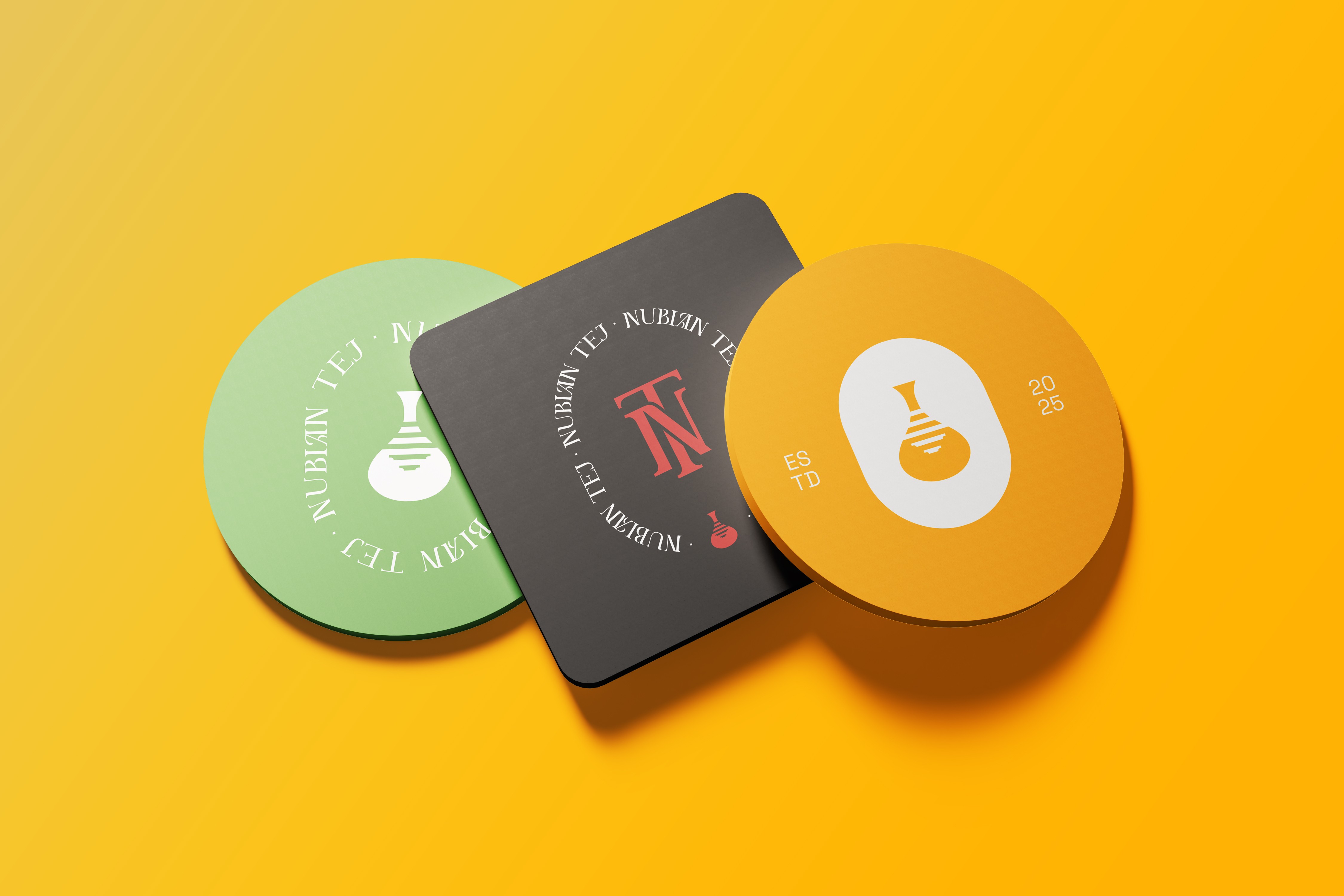
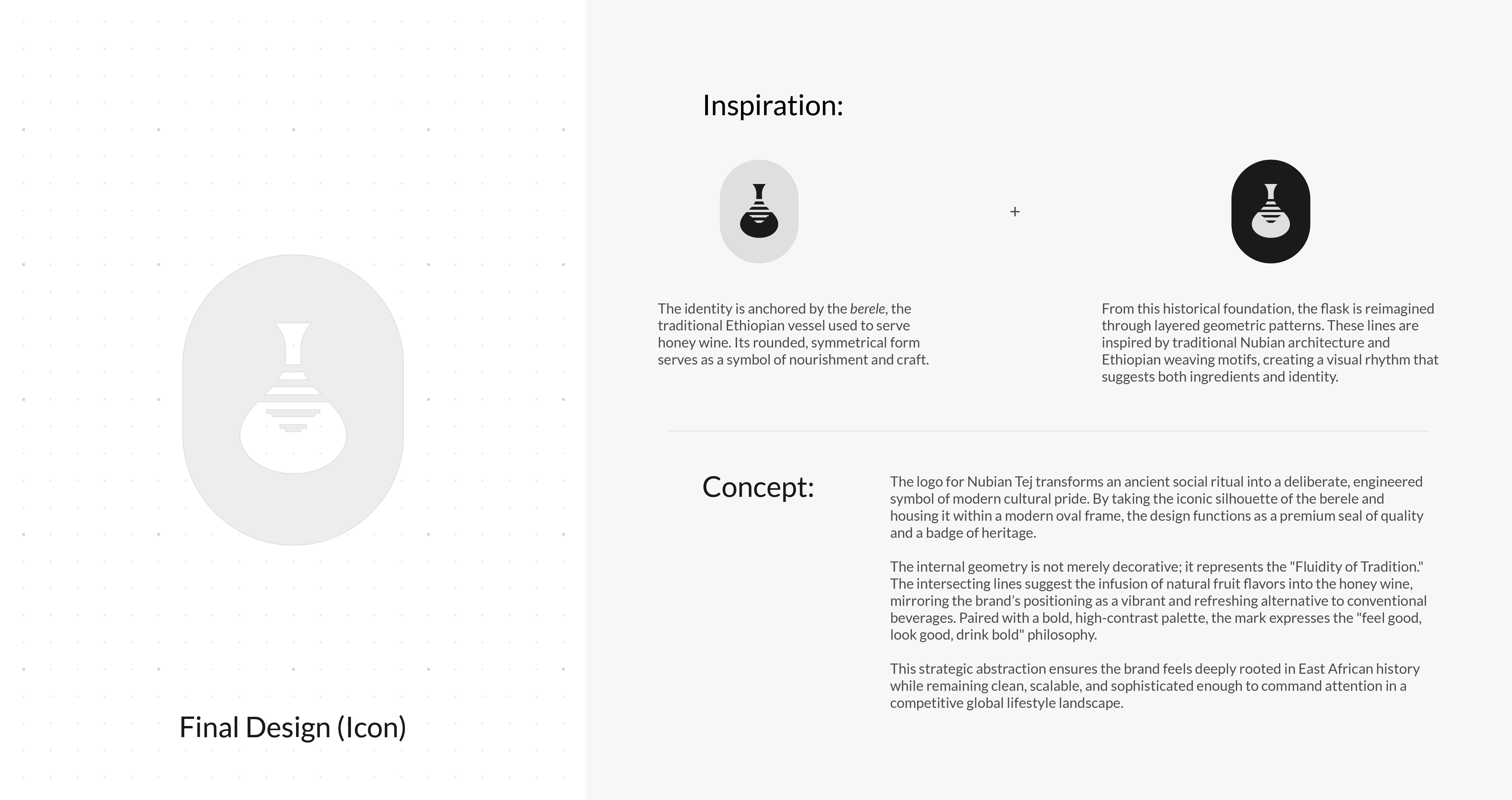
Heritage Reimagined
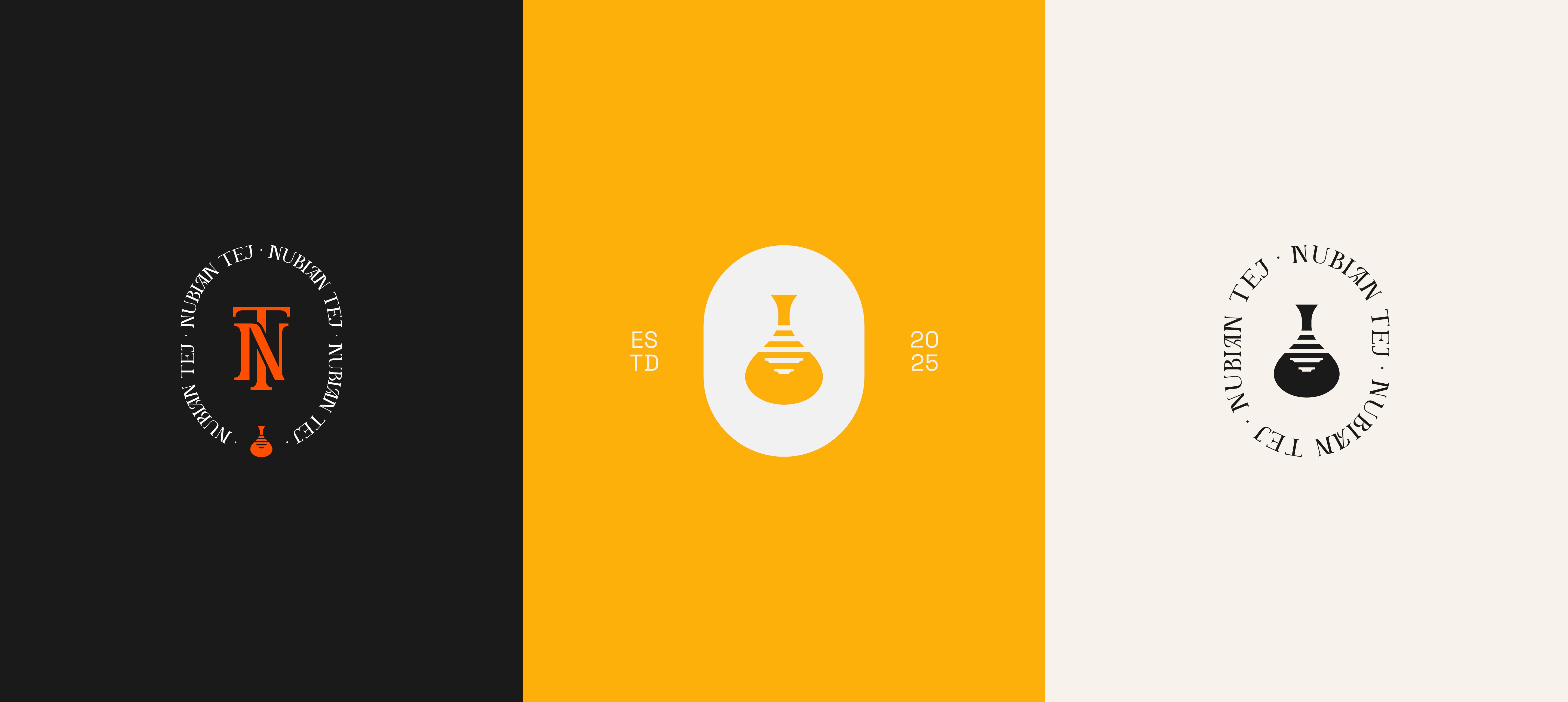
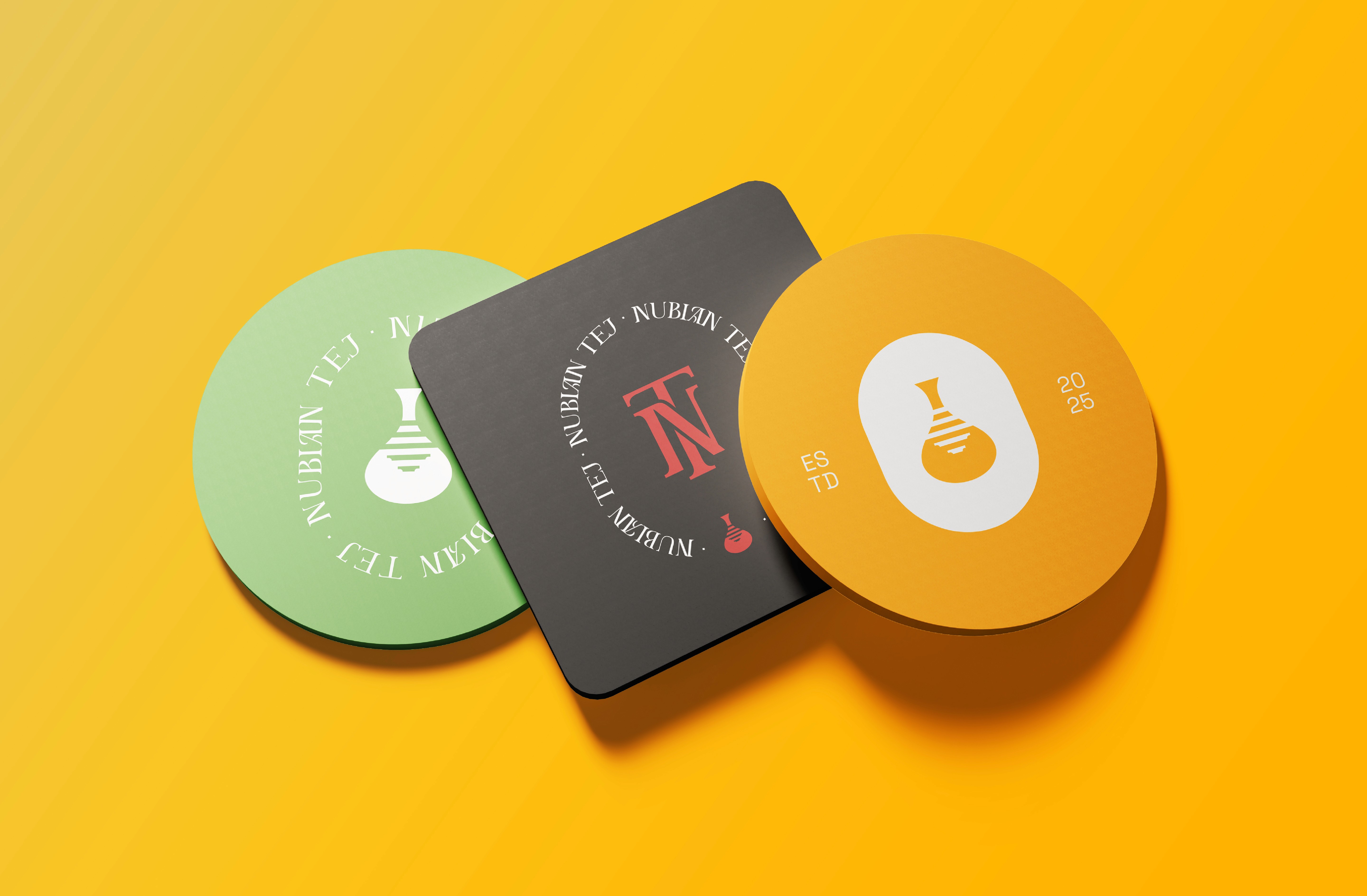
The visual identity is anchored by a culturally rooted emblem that blends the iconic silhouette of the berele (a traditional Ethiopian vessel) with layered geometric symmetry inspired by Nubian architecture and jewelry.
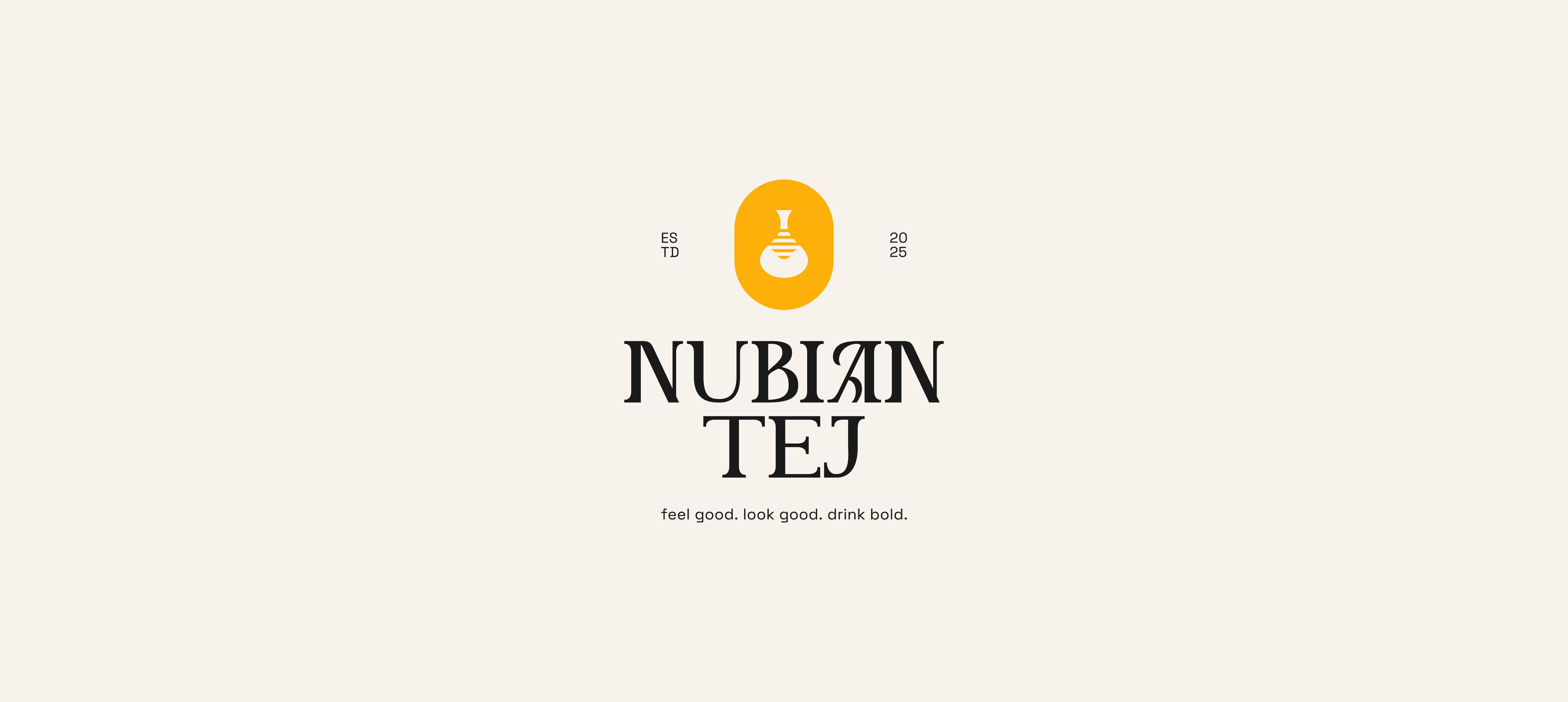
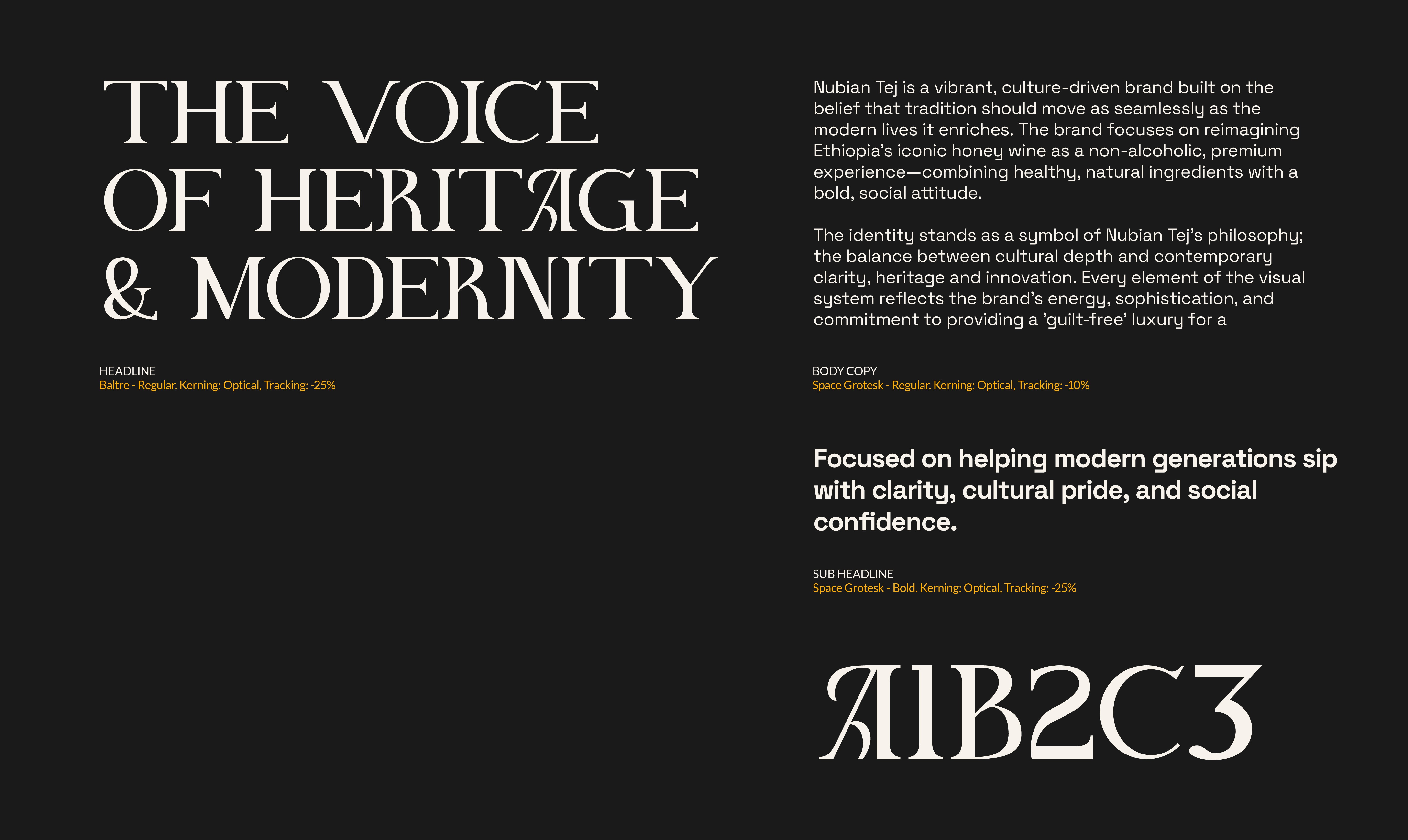
Typography: The pairing of Baltre and Space Grotesk serves as a typographic metaphor for the brand, balancing the elegance of tradition with the precision of modern design.
Color Palette: The system uses a high-contrast palette of Golden Honey, Nubian Violet & Abyssinian Red to reflect the natural ingredients while evoking a sense of vibrant, organic energy.
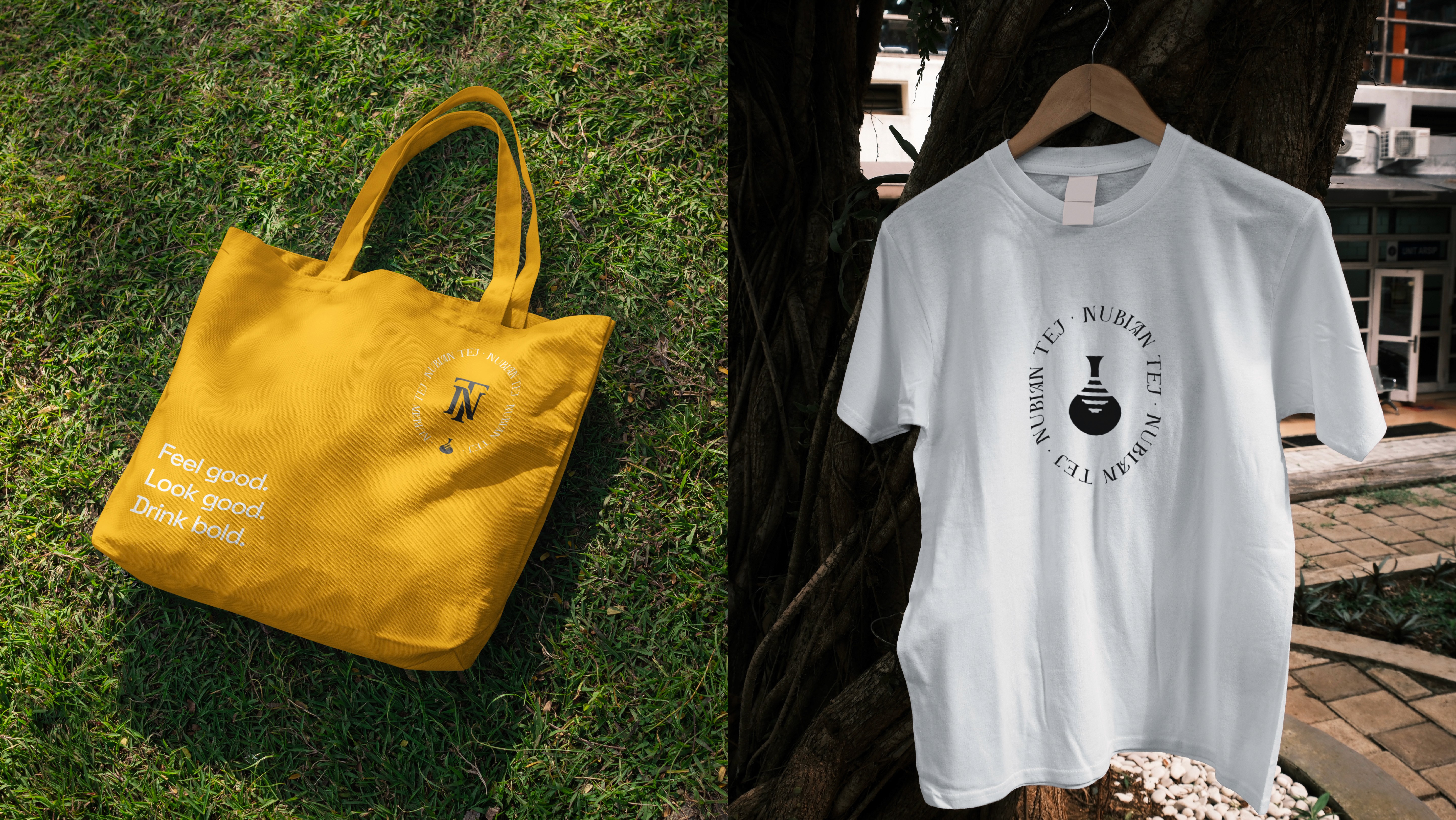
Outcome: The result is a cohesive, "identity-first" system that successfully translates the brand’s "feel good, look good, drink bold" philosophy across digital platforms, premium packaging, and physical merchandise.